RELATIONSHIPS
This unit explores relationships through photography.
|
|
glove and ball, piant brush and paints, shoot and score, key and lock, slow and quick, food and drink, brands, film and popcorn, food and sauce, salt and pepper, marriage, family, husband and wife, brother and sister, real and fake, police and thief, animals, cow and beef, animals and food, twins, male and female, men and women, cloud and rain, tide in and out, glass half empty/half full, medicine and drugs, religion and science, art, history, numbers, natural and artificial light, asleep and awake, light and dark, day and night, analog and digital, notes and coins, urban and rural, school and grades, office and data, old and young, electronic and natural, organs, hot and cold, humans and animals, nature, love and hate, love, happy and upset, laughing and crying, birth and death
|
Altering the Context
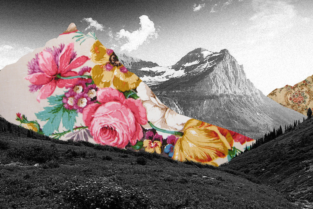
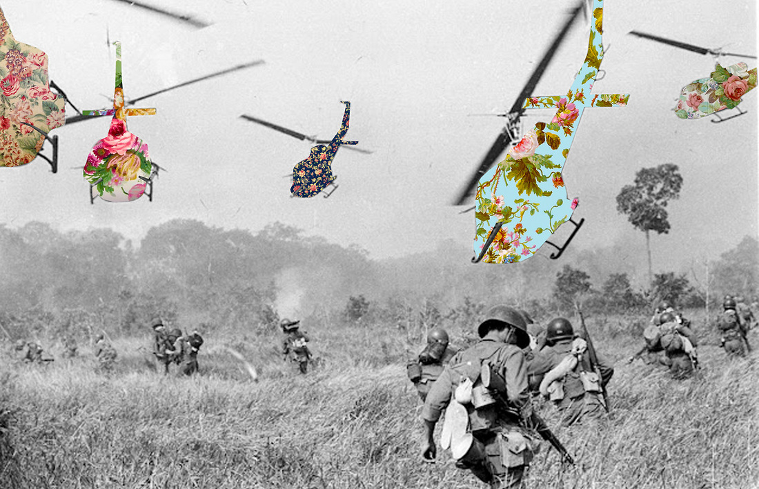
Guy Catling
Guy Catling is a graphic designer who takes old photographs and adds a modern touch to them. As you can see from the images below, he fills in parts of photos with colourful patterns or pictures. This contrast within his work between the original black and white photo with the vibrant patterns creates a new meaning to the image, and challenges us to think about our relationship between images that originally had no meaning to us. I particularly like his choice of patterns and prints in his images as they are bright and positive. For example, the bright blues and pinks are normally associated with happiness, yet Catling uses them on top of negative things inlcuding war helicopters. This alteration of an image allows us to question the meaning behind the new photograph, and take a new view of an image.
|
|
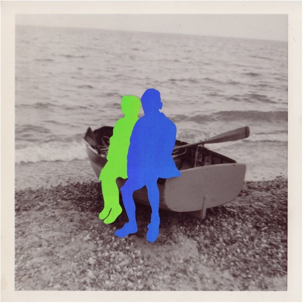
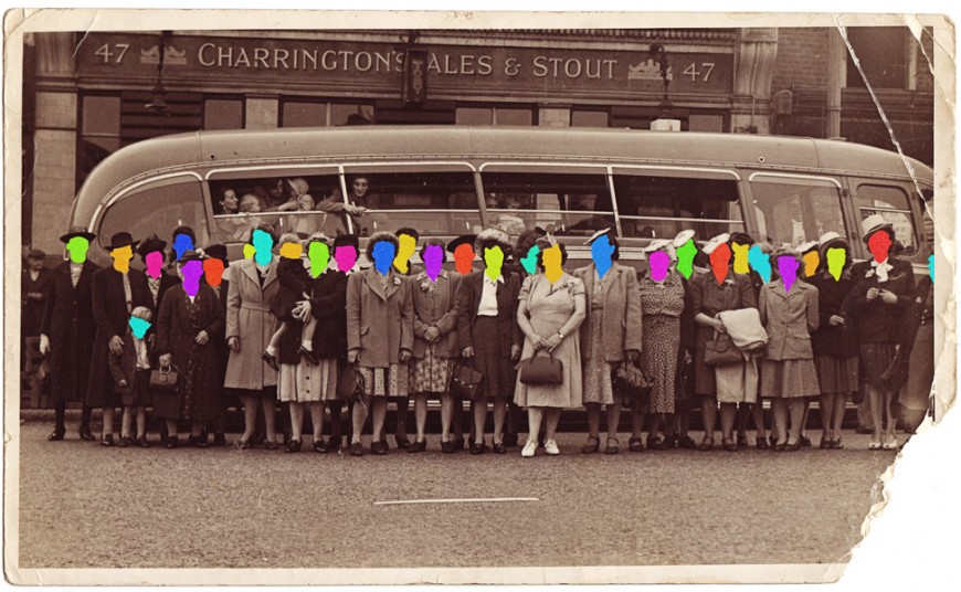
Hayley Warnham
|
Hayley Warnham is an artist who created a similar piece of work, entitled 'Everything is Beautiful'. Instead of using patterns and images to fill parts of photos, she simply uses blocks of colour. Her choice of bright colours contrasts with the quality of the original black and white photos that she uses, and adds a unique feeling of emotion and perspective to the images. I like how the people in her images lose a sense of identity when they've been filled with colour. This makes us, the viewers, focus more on the setting and the meaning of the image, without purely focusing on the appearance of the people. I also like how the various colours can suggest different emotions, provoking even more thought about the meaning behind her work.
|
|
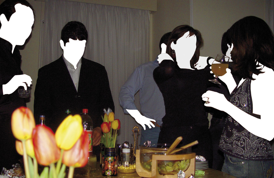
Amir Ali Ghassemi
Amir Ali Ghassemi is an Iranian artsist and graphic designer who created similar work to the two artists above in her series, 'The Party Scenes Series'. However, she doesn't use old black and white photographs, but instead takes her own digital colour photos. Also, instead of filling parts of images with patterns or colours, she fills in the skin of people with white. This creates an almost scary effect as a huge part of the people's identity is removed. Ghassemi makes a point of how much our clothes and hair can impact upon our identity, as viewers are left to get a sense of the people in her images by only seeing this. Her work has been described as an 'intimate, real-life' depiction of the social culture and party life of the Iranian youth. She has been clever to remove the faces and skin of the people as it makes us focus on the settings that the people are in, and be more aware of what they are actually doing, instead of just focusing on their faces, as we usually do in photographs. Yet some could say that not being able to see their faces, their true identity, means that we cannot properly get a sense of the atmosphere within the images. Maybe Ghassemi has highlighted the importance of true body and facial features within photography to allow us to understand the whole image.
|

|
My Response To The Artists Above
The intention of this task was to create images in a similar style to the three artists mentioned above. I decided to try and replicate the work of mainly Haley Warnham, although one of my images is inspired by Guy Catling's work. I wanted to capture their style of portraying relationships between colours, and an altered reality. As I am a big fan of bright colours, I enjoyed this task, and creating a strong contrast of colours within an image already taken before.
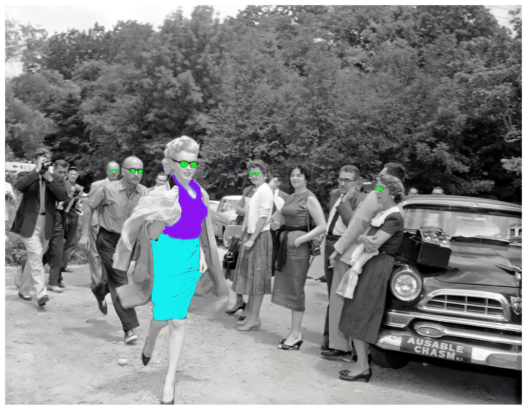
June 29, 1956 - Marilyn Monroe escaping paparazzi
I found that editing these photos was quite difficult, simply because it was hard to be precise with the selection tool on Photoshop. This meant that the edges of parts of images that were coloured looked rough, and did not look subtle or blend in to the rest of the image. Also, in some images, such as the one above, editing very small parts was hard as filling in colour would fill more than I desired. However I did find that choosing colours to layer over sections of images was easy and worked well as all bright colours looked visually appealing over black and white.
This response would have even better if I had spent more time selecting the parts of images where I wanted to insert block colour or patterns. This would have given me an overall smoother look to my images and I would have no rough edges. Also, I would have liked to have taken my own black and white photos and then changed added new colours. As this was a class task, we could only edit black and white photos that had already been taken and that we could find online.

Memory: Childhood
This task explores the realtionships between people and their former self.
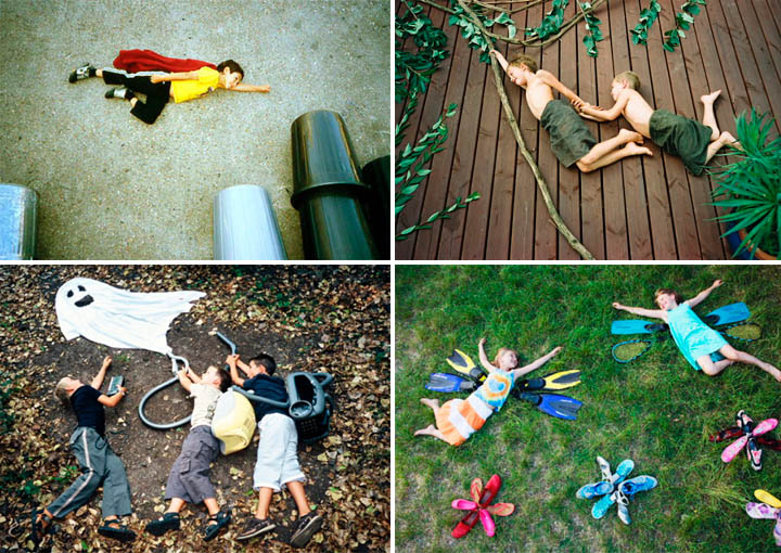
Jan von Holleben's work
|
|
These photos were inspired by the work of German photographer Jan von Holleben. He creates images intended to fool the viewer's mind by using unusually different perspectives with his shots. As you might be able to tell, the people in his photos are positioned on the ground to look as if the shot has been taken from a straight ahead angle, when actually they are taken from an almost birds eye view. I particularly like this style of photography for its simplicity and 'fun' quality. By this I am referring to the positive attitude that runs throughout these photos. Every memory or event captured are based upon happy scenes, where the subjects are smiling. The bird's eye view angle emphasises this quality of the photographs, and shows the depth of Holleben's imagination.
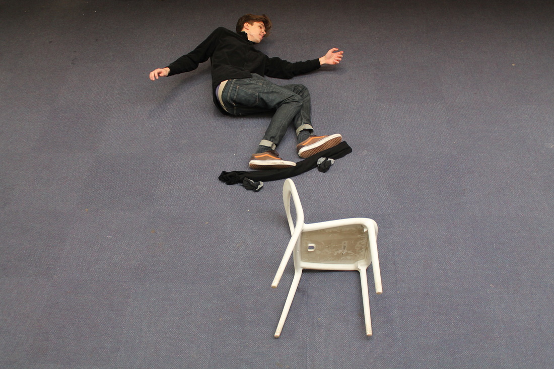
For this task, I tried to produce work in the style of Holleben. A strong memory I have of my childhood is skateboarding. I had an idea where I could set up an image of me jumping over a chair, and thought that it would be easy and very simple to achieve. The photo above shows the relationship between my chilldhood and memories of skateboarding.
One difficulty I had when setting up the shot was trying to achieve as close a bird's eye view of myself as possible. As me and my classmate used a ladder to take the photo from above, we found that it was hard to position the camera above me without getting the bottom of the ladder in the shot. I was aware that if it was too far away from a bird's eye view shot, the image would not have the same effect, as it would be clear that i was in fact lying on the floor instead of 'jumping over a chair on my skateboard'. However, we managed to reach an angle where the shot still captured the scene I had set up, and was clearly influenced by the style of Holleben. I particularly like the simplicity of this image. As there are not many items in the shot, you are instantly drawn towards me and then the skateboard.
This shot could have been better if I had managed to take it from an exact bird's eye view, and if I had had more time to arrange myself and the items so that it looked as believable as possible. I would also maybe take the shot on a background that looked more dimensional, as Holleben's work does. For example, I could have laid down on a huge print of a street, or skatepark to make the image look more believable. Maybe more items that link to my childhood or other memories in the shot would make the theme behind this image more clear, but I still like the simplicity, and that there is not any clutter or distractions in the image.


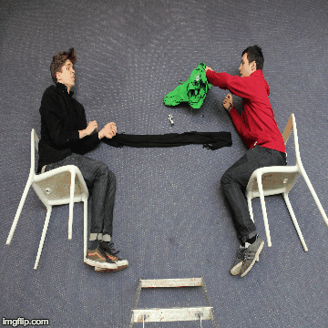
As you can see below, me and my classmate produced a gif, representing one of his childhood memories. It is meant to capture him being angry at losing a board game, so throws the game off the table in fury. It is also influenced by the work of Holleben, and we thought that his style of capturing moments or memories would work well to replicate for this particular memory.
We unfortunately had a few problems whilst making this gif. At the bottom of the gif you can see the ladder that was holding up another classmate of our's who took the shots. This makes the gif appear less realistic and detracts from the overall composition. If we could improve upon it, we would have taken the shots from a more birds eye view, so that you could not see the bottom of the chairs, and so that you would see us from a straight-on view. Also, the game does not land on the table, making it less clear what is happening in the gif. I also believe we could have taken more images if we had had the time, to make it more obvious to what is happening in the scene, and could have made the whole gif look more smoother and realistic. This would make our influence from Holleben more obvious.
We unfortunately had a few problems whilst making this gif. At the bottom of the gif you can see the ladder that was holding up another classmate of our's who took the shots. This makes the gif appear less realistic and detracts from the overall composition. If we could improve upon it, we would have taken the shots from a more birds eye view, so that you could not see the bottom of the chairs, and so that you would see us from a straight-on view. Also, the game does not land on the table, making it less clear what is happening in the gif. I also believe we could have taken more images if we had had the time, to make it more obvious to what is happening in the scene, and could have made the whole gif look more smoother and realistic. This would make our influence from Holleben more obvious.
More Childhood Memories
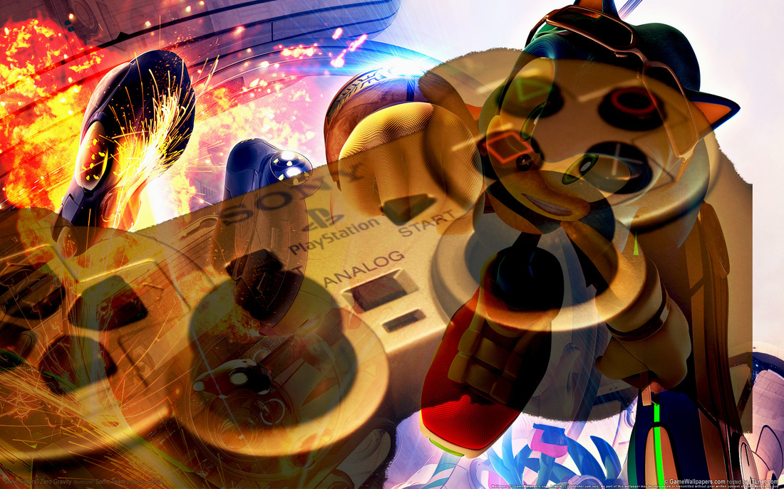
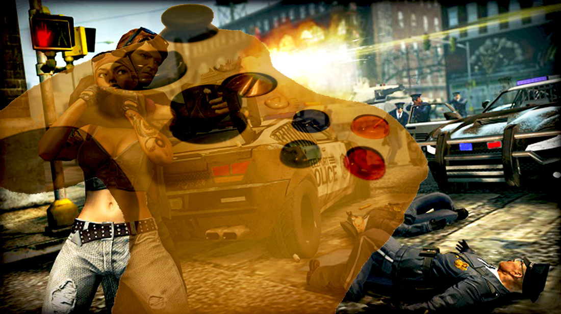
These images capture my memory of playing video games when I was younger. I have created two images on photoshop, using photos I took of my games console controllers, and stills from video games. This merge of animated and real images creates a unique result, where something intangible is placed under something physical, with both sharing a strong relationship between each other. One would not be able to play and experience these video games without the use of the controllers.
I took photos of my old console controllers and then cropped them so they were only the controllers themselves. I then copy and pasted them on to video game stills on photoshop, and used the opacity slider to merge the two images together. I found that I had to be very slow and precise when I was changing the opacity, as it was very easy to set the opacity to either very low, so you could hardly see the controllers, or very high, where the controller covered too much of the other image, and you could not see through.
I particularly like these photos because they explore the relationship between memories and childhood as well as the relationship between virtual and physical. These photos would have been even better if I had been able to capture my own in-game stills. As I do not have the technology to do this I had to download stills from the internet, but I would have loved to take them myself as I would have had more control over the angles, colours and overall look of the finished images.
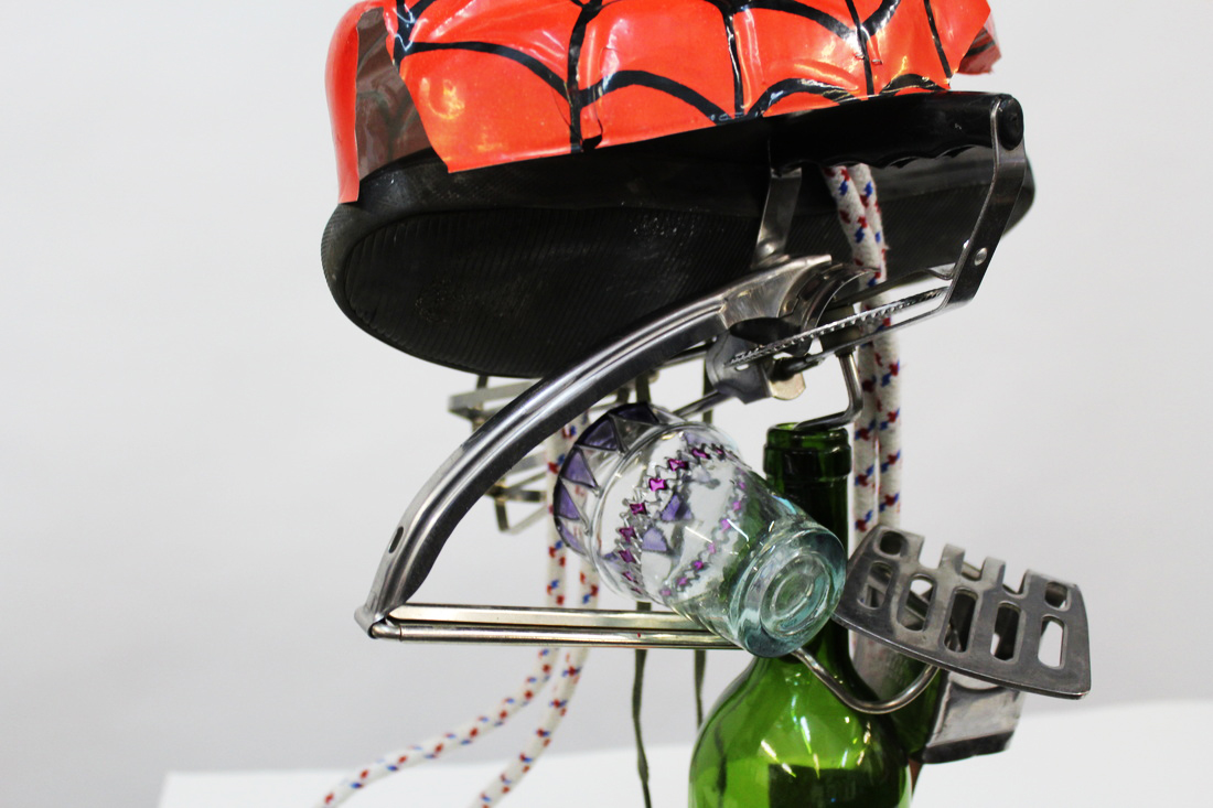
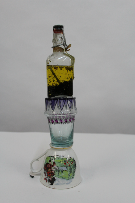
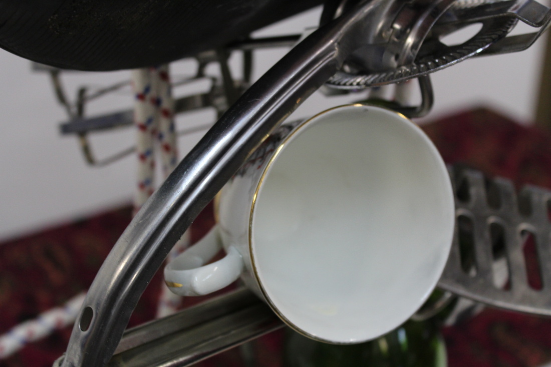
Objects
Peter Fischli & David Weiß
This Swiss duo created work where different everyday household objects balance upon each other. They explored relationships between everyday objects, in their very own unique, and visually surprising way. Unfortunately, Weiss passed away in 2012, but the two had collaborated since 1979, and have been considered one (two) of the world's top contemporary artists.
These artists created both photos and films where they would make normal objects take on a role different to their own. For example, they would balance items on top of each other, or continuous cycles of events. e.g. a tire forcing a ladder down a slide, which then in turn hits a table. Their work is incredibly precise and perfectly planned, making it visually surprising.
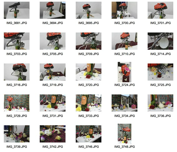
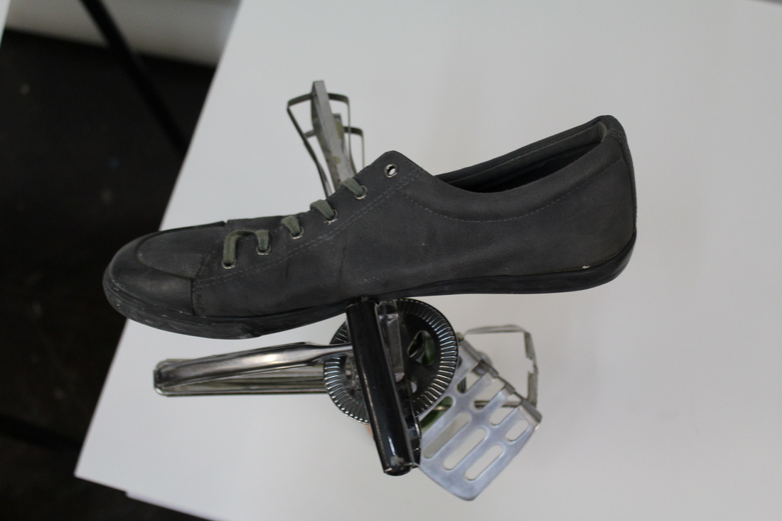
Contact Sheet for photos inspired by Fischli & Weiss
For this task I worked with a classmate to balance random everyday objects together. We found that we were quite lucky with our balancing as we managed to position more objects on top of each than we thought we would. During this task we made two sculptures of balanced objects, one with only 3 items, and another with many more. The one with many objects took a while to create as we were very careful to not knock everything down, as throughout this process we managed to smash two glasses.
|
|
I particularly like the simplicity of these images, as they are against a plan white background. But the mix of colours and reflections from the glass objects stand out in the photos, and the viewer's eyes are drawn to how the items are balancing upon each other. I found that photographing the sculptures once we had finished creating them was quite difficult. This is because I was not sure which angle would look best as a photograph, and which angle would show how perfectly the objects were balancing on each other.
These photos would be even better if I had managed to create even bigger sculptures with my own choice of objects. As this task was carried out in our school, we were limited to a prop box. I would also have made a film inspired by Fischli and Weiss, where objects would hit each other in a domino-like chain reaction.

|
|
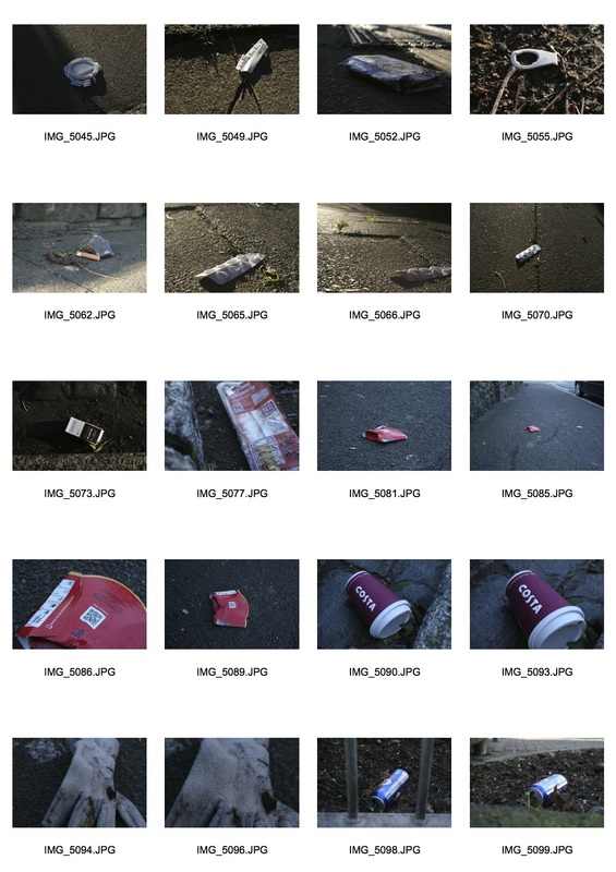
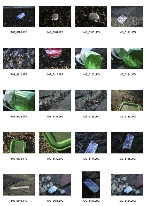
Everyday Objects
Richard Wentworth has produced work which shows everyday objects in a subtle yet, unusual way.
Contact Sheets for 'Everyday Objects' Shoot
|
|
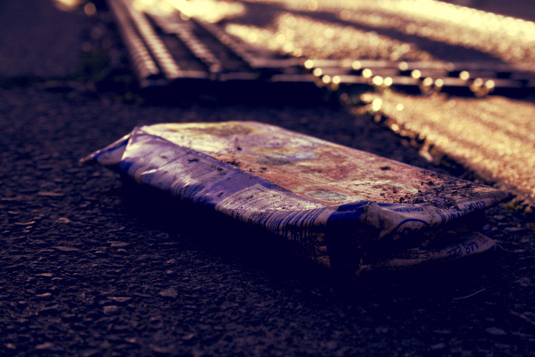
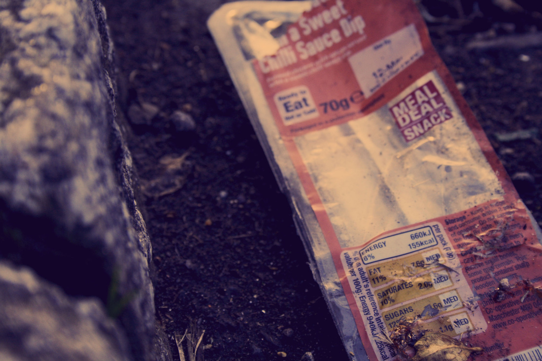
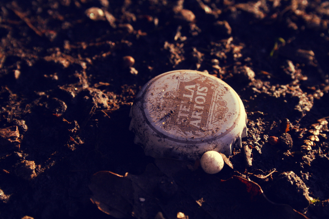
Whilst the title for these photos is 'Everyday Objects', they may not at first seem like what you would initially think of being an everyday object. However, they are the types of objects that we, in a 21st Century city, do in fact see every day. They are easy to miss as most are found on the ground, but when you go to look for them it won't take long before you come across at least five different pieces of litter or random items scattered around.
|
|
|
|
The photos above were taken on streets around my local area, during a thirty minute shoot. They are of everyday objects and miscellaneous items that are often on streets, but are usually blindly dismissed by people. I wanted to take very close up photographs of these objects to capture their detail and decay from being on the ground. Whilst many of the items are produced in high quantities, these specific ones are unique as they have their own marks, dirt and damage on them. I found that they were very easy to photograph as most angles close up captured them in a way that I wanted to portray them.
Film Noir
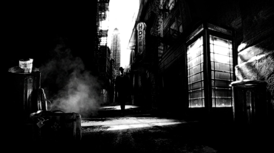
Film noir is a famous and popular film genre, based on crime dramas that emphasise disbelieving attitudes and sexual motivations. It arose in the early 1940s and remained popular until the late '50s. It is famous for its iconic style of low-key-black-and-white visuals, with mysterious shots and prototypical plots.
In French 'film noir' translates in to 'black film', which obviously makes sense for a perfect description as this genre largely features incredibly dark shots, and being shot in black and white only emphasises this even more.
In French 'film noir' translates in to 'black film', which obviously makes sense for a perfect description as this genre largely features incredibly dark shots, and being shot in black and white only emphasises this even more.

|

|
As you can see from these stills, contrasting colours (black and white) feature heavily in Film Noir. Shadows and outlines of characters create a sense of mystery, and suggest a cynical attitude.

|

|
Contact Sheet for Film Noir Shoot
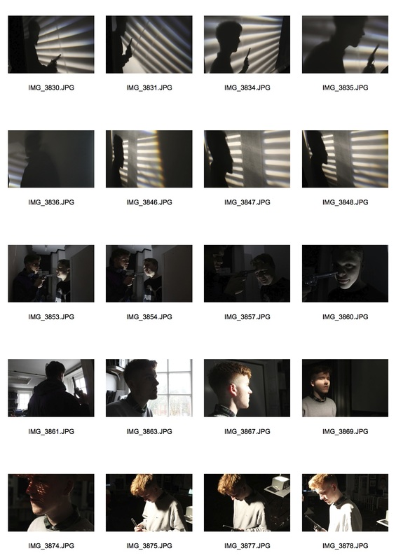
With this task I tried to take photos in the style of Film Noir. At first I thought that shooting photos would be easy to fit the style as I knew that it would involve a lot of dark shots with contrasting colours. However, it was actually harder than I anticipated. This was because it was difficult to capture shots with the right light balance, and it took a while to find out which aperture on my camera was the best for what I wanted.
Below are a few photographs that were part of my film noir shoot that I edited in Photoshop. I wanted to create very dark shots, where the subjects and subject matter were vivid and unclear. As I worked on this task with classmates, we found that we preferred using minimal lighting to make our shots darker, in turn making them more mysterious and create a sense of suspense.
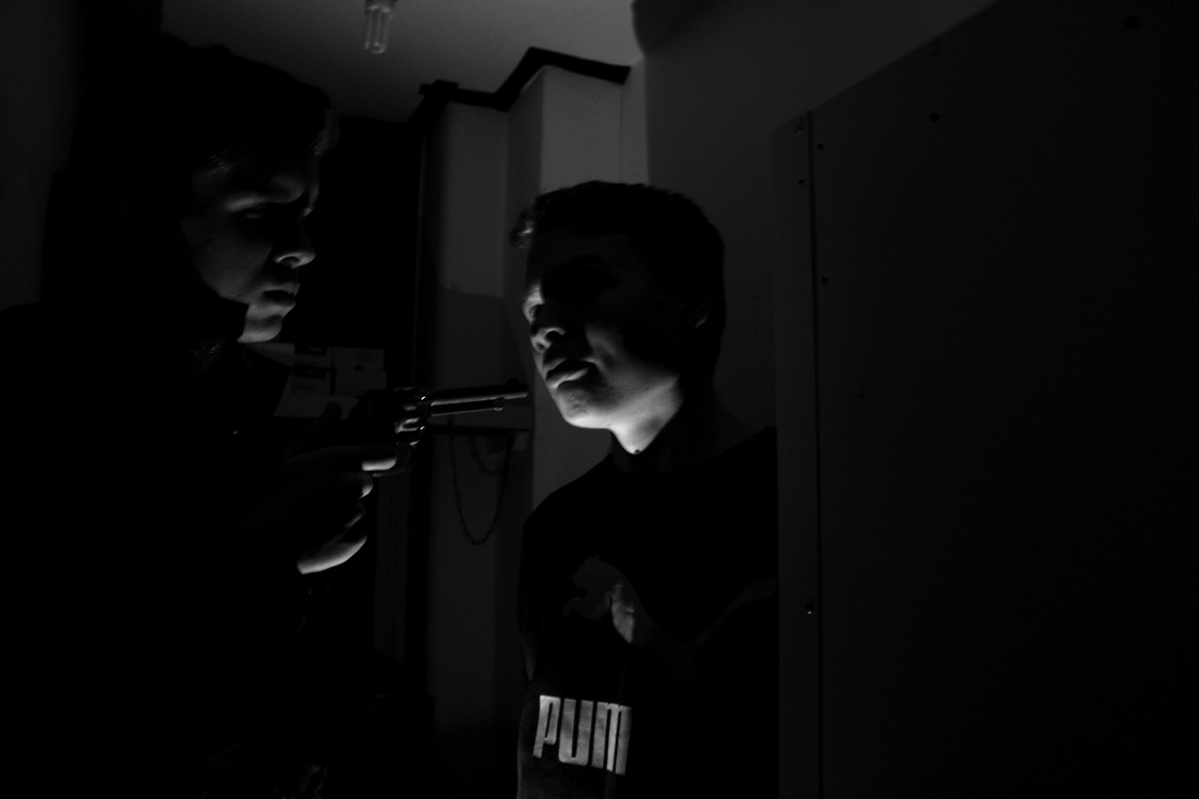
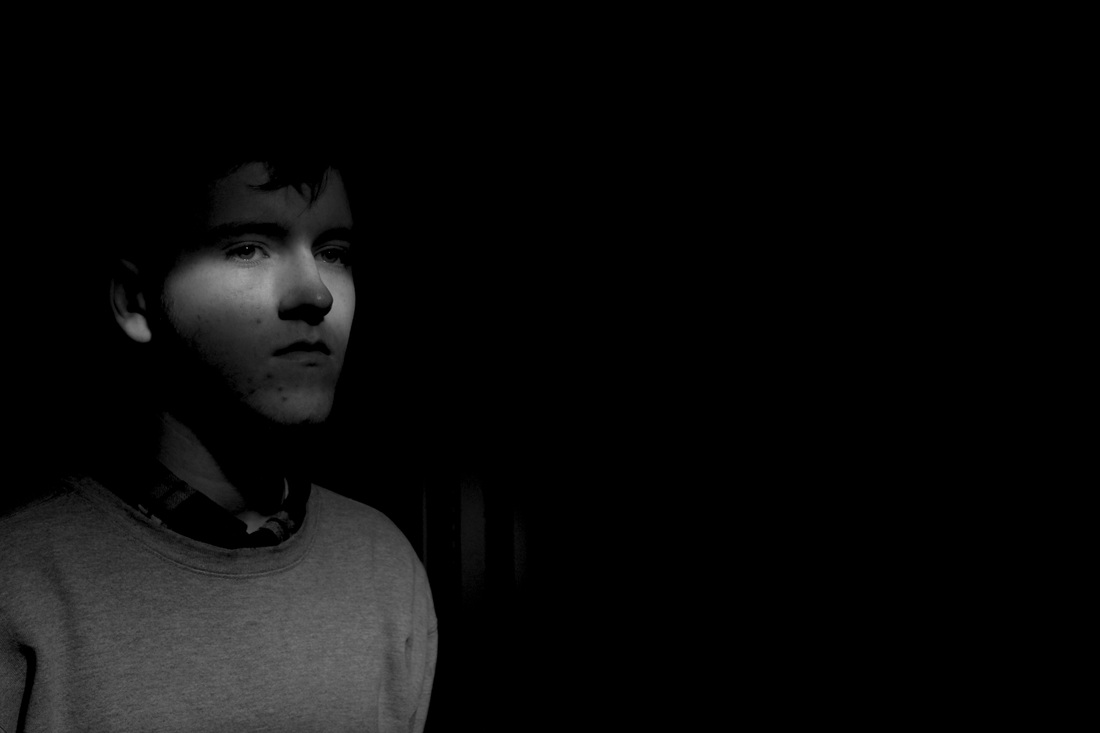
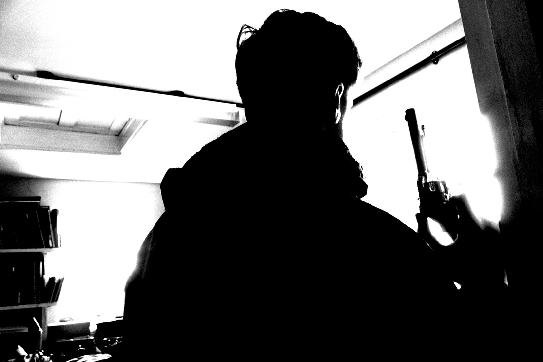
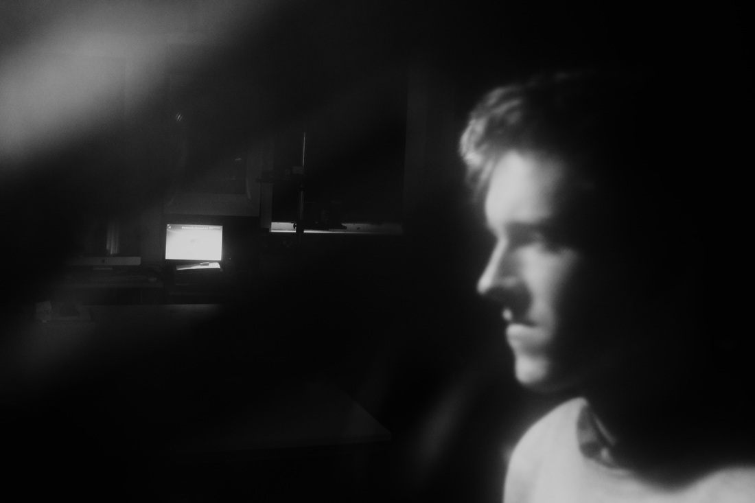
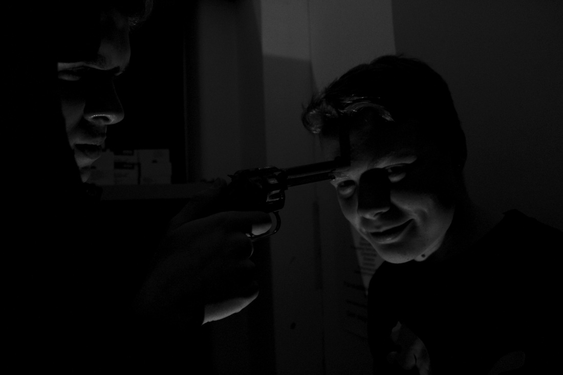
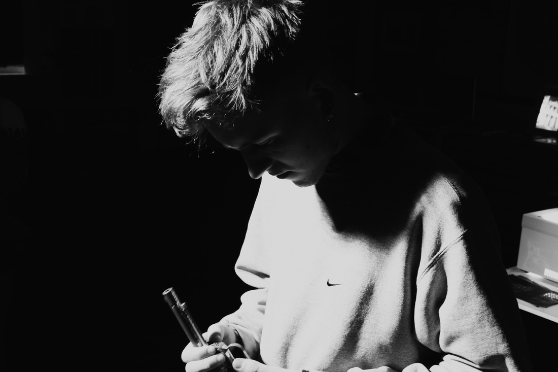
Whilst taking these photographs, I knew that they were going to eventually be in black and white, so that they could portray more of a film noir quality. This meant that I didn't focus on the colours in my compositions, but rather the shades of colour. I knew that if I had too many bright or too many dark colours, then when I turned it in to a black and white image, it simply would not look very appealing. However, that's not to say that I didn't want my photos to be very dark. As you can see above, some of my photographs feature a lot of very dark negative space, with a heavily contrasting figure or background. But then others are extremely dark, with viewers vaguely being able to see the outline of people's features. I like both styles as they both have a mysterious quality within them, and can suggest many ideas. Also, within most of them, the subjects and exactly what is happening in the image is very unclear, making it more exciting for viewers as it causes them to provoke their own thoughts and interpretations on to the images.
Three Strands
1st Strand
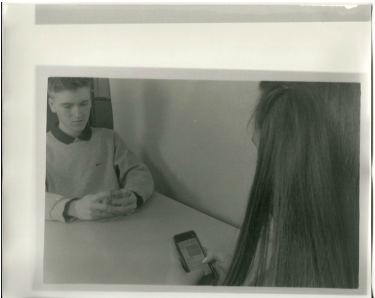
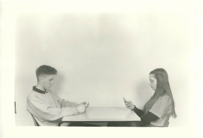
This first strand is about the relationship between people and technology - especially within couple relationships. As the 21st Century is progessing, more and more people are using mobile phones, and social networking sites to communicate to each other. Whilst this can be said to be a great thing as more people can communicate to others easier, it can also be said that people are spending too much time using this technology, and are missing out on traditional 'real life' conversations.
I decided that I wanted to use film as opposed to digital for a number of reasons. After photographing every task above for this unit on digital, I wanted to do something different, and I have always liked the simplicity of film cameras. By this I mean the ease of taking a photo. Often when using digital cameras it easy to take many shots of the same image but with slightly changing the settings on the camera to get the best shot, but with film cameras, you usually only take one shot as there are only 28 photos on a roll of film. I also thought that as I was taking photos to represent relationships with modern technology, I thought that it would be an interesting and unique juxtaposition if I took these images on an older, less commonly used piece of technology.
I decided that I wanted to use film as opposed to digital for a number of reasons. After photographing every task above for this unit on digital, I wanted to do something different, and I have always liked the simplicity of film cameras. By this I mean the ease of taking a photo. Often when using digital cameras it easy to take many shots of the same image but with slightly changing the settings on the camera to get the best shot, but with film cameras, you usually only take one shot as there are only 28 photos on a roll of film. I also thought that as I was taking photos to represent relationships with modern technology, I thought that it would be an interesting and unique juxtaposition if I took these images on an older, less commonly used piece of technology.
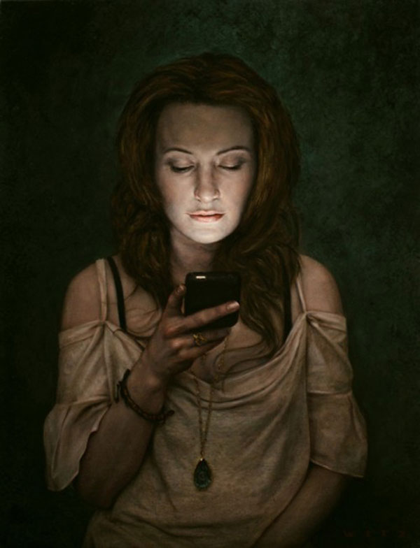
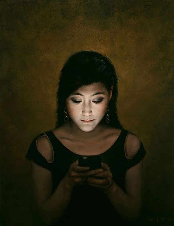
This strand was inspired by the work of two photographers, including Dan Witz. He has produced work where he's taken simple portraits of people who are on their phones. The people in his images are in a dark area, enhancing the bright screen of their phones which shines on to their face. I like his work a lot for the subtleness yet instantly recognisable underlying message.
|
|
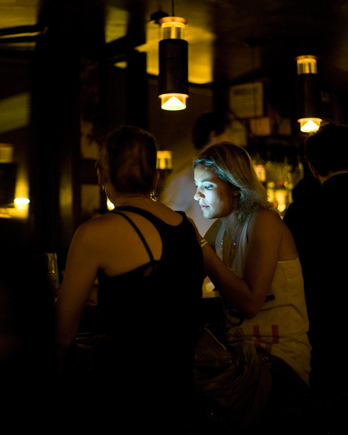
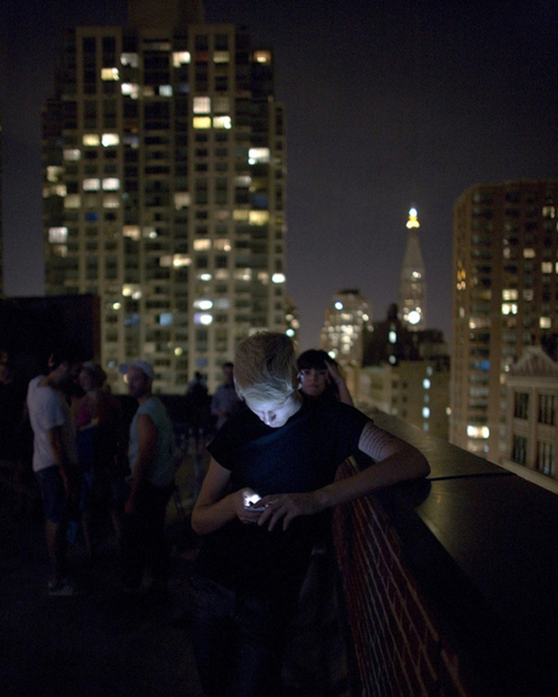
The other photographer this strand is inspired by is Seymour Templar (below). He produced a piece of work in a similar style, entitled 'Social Lights', containing photographs people in social events, around other people, unlike Witz. A similar message is portrayed in his images, but shows it in a more 'real life' setting, as viewers can clearly see how the individuals in the shots are detached from the socialising around them.
|
|
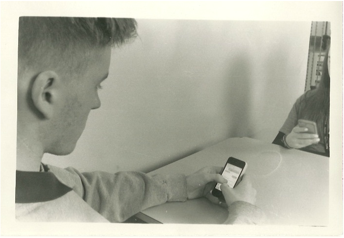
Below are my photos for this strand. Whilst they are set up scenes, I believe that the message behind the photos is still clear. I wanted to capture the relationship between people and their phones, and explore how phones can take a huge role in our social activity. When I was planning out how I wanted these photos to look, I decided to take very simple images, only focusing on two people, with nothing else in the background. I also wanted it to be very clear that they whilst the people were sharing time together, they were simply spending more time on their phone than talking to each other. You could infer from the photos that they're socialising more digitally than actually talking to each other. It's also clear in two of the images that they're messaging others on their phones, which shows a difference in relationships, between the one the two people share, and the ones they share with others on their phones.
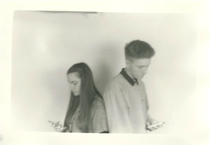
These photos were very easy to set up and shoot as they are very simple. I took them in our school photography studio, so was able to set up the lighting to how I desired, and was able to achieve a plain white background from the use of a backdrop. Unintentionally, the photo above is blurred. When I took the shot I thought it was in focus, but then I developed the film I was pleasantly surprised as I really liked the blur of the image. I realised that it adds to the meaning of the photo, as it could be inferred that the two people's relationship in real life is fuzzy, and not so strong, so they resort to socialising via technology, where less effort is required for communicating.
As I took these on a film camera, I was not completely sure whether the settings on my camera would produce the best image when I took these photos, as I could not see till after I developed the film. However I was very pleased with my results, and found that I could expose the prints to different amounts of light to change the brightness and contrast of the images, which allowed me to get the perfect contrast of black and white.
As I took these on a film camera, I was not completely sure whether the settings on my camera would produce the best image when I took these photos, as I could not see till after I developed the film. However I was very pleased with my results, and found that I could expose the prints to different amounts of light to change the brightness and contrast of the images, which allowed me to get the perfect contrast of black and white.
|
|
If I was to shoot for this strand again, I would try to incorporate light from the phones being shone on to people's faces, as I particularly liked how this looked in Witz and Templar's work. I would also like to take shots in a public social scene, where people are clearly on their phones instead of engaging in real life social conversations. Another idea that I could take forward would involve capturing shots that showed a phone screen more, and maybe showed what someone was doing on their phone, and contrasted it with what they were missing it out on in the background.
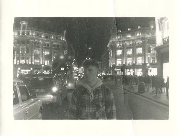
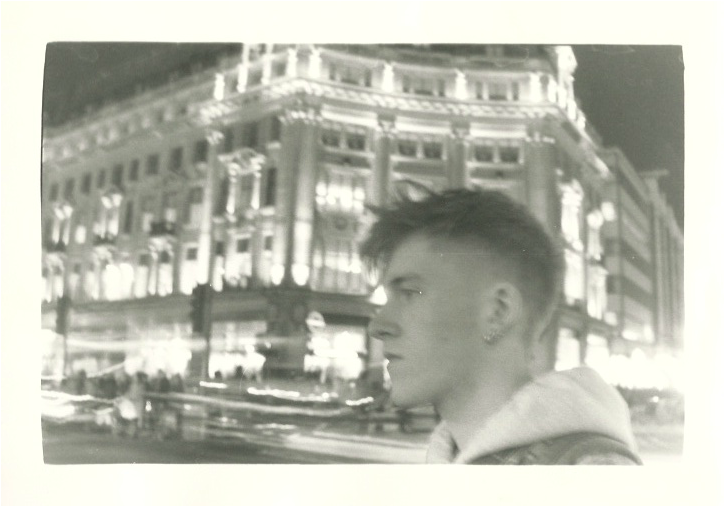
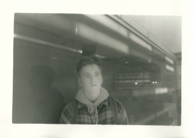
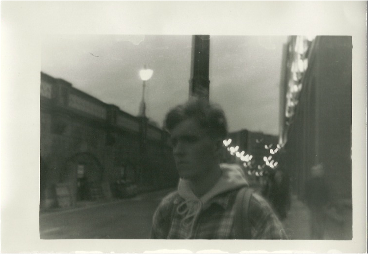
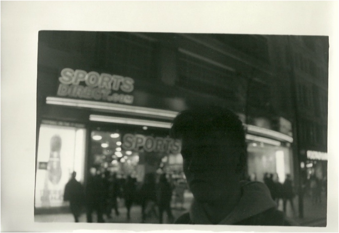
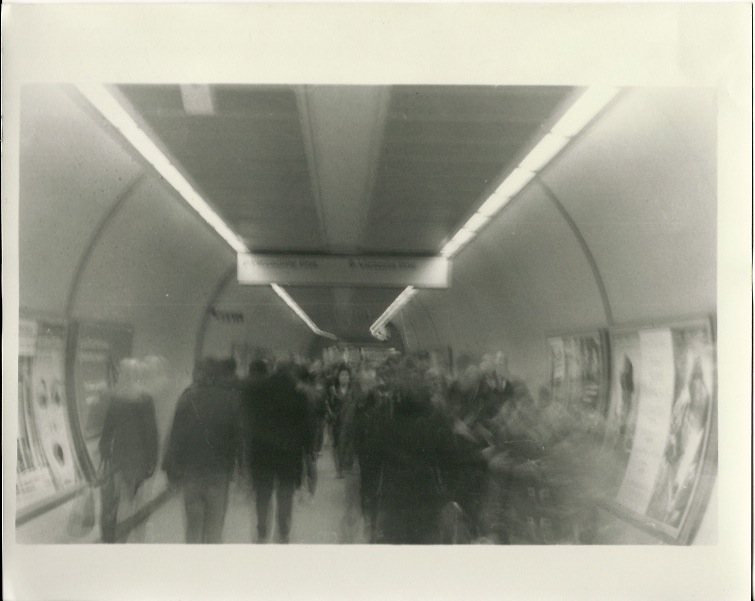
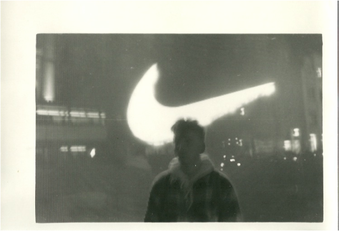
2nd Strand
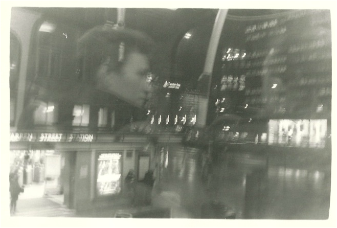
This strand is based around the relationship between people and the 21st century. In today's world we are surrounded by technology and rapid movement. Sometimes it's hard to step back from the business of life and realise how hectic the modern world is becoming. I wanted to portray and capture the feeling of not being aware of where you are, being lost in a . I thought that I could try and capture this by taking photos of someone in front of locations that are slightly blurred and sometimes also with the main person blurred as well.
|
|
|
|
|
|
|
|
3rd Strand
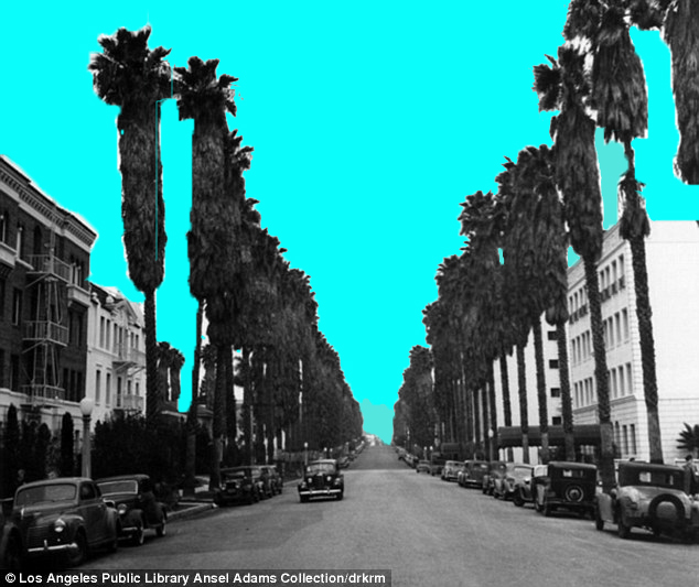
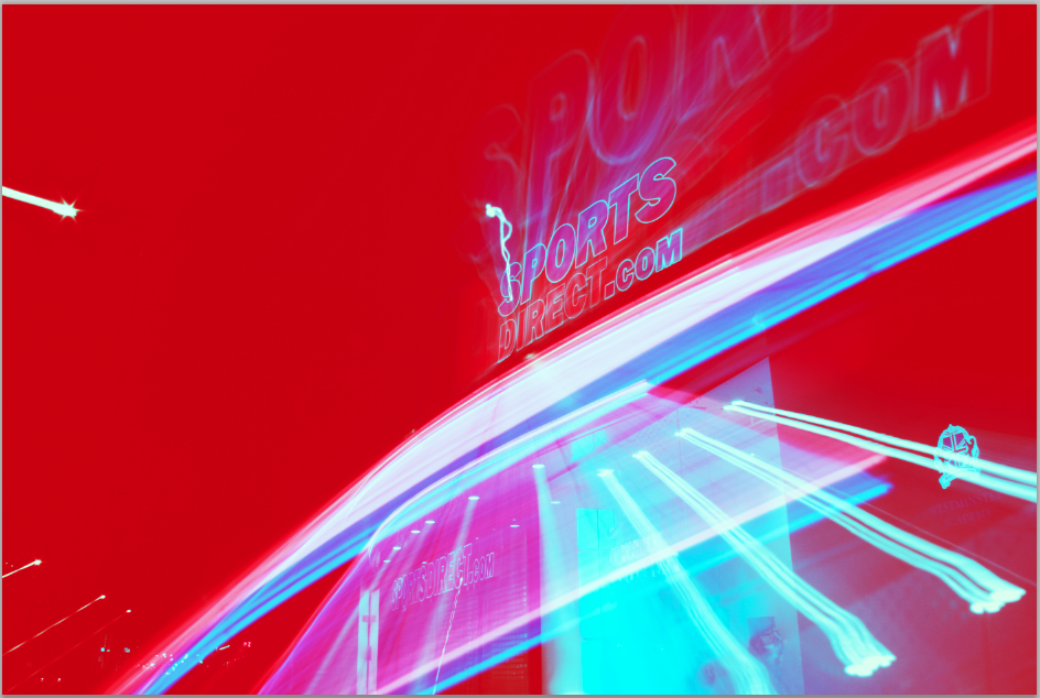
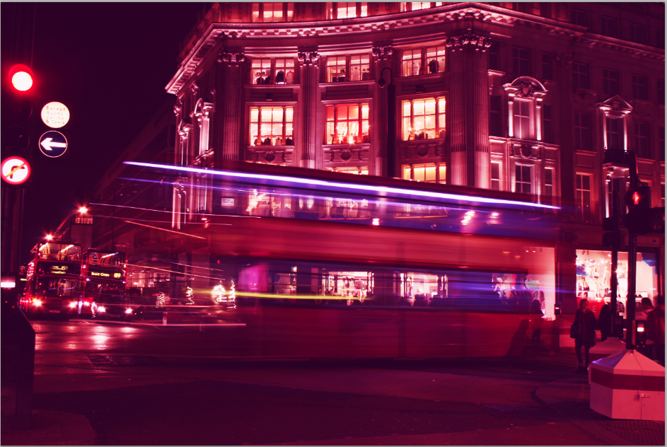
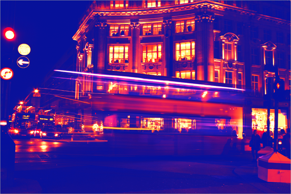
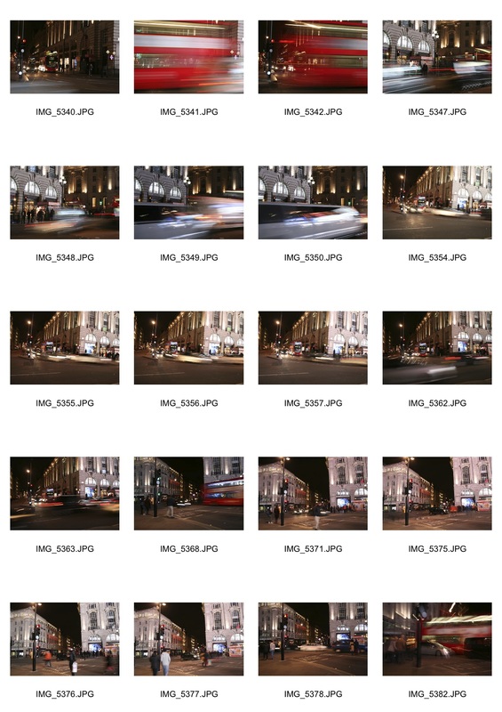
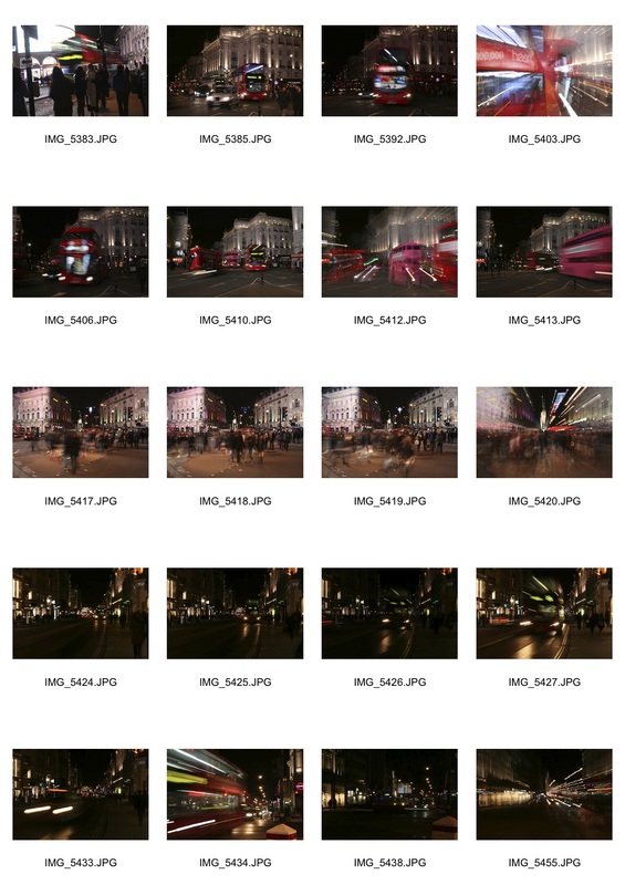
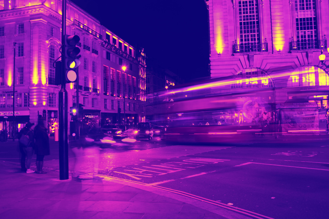
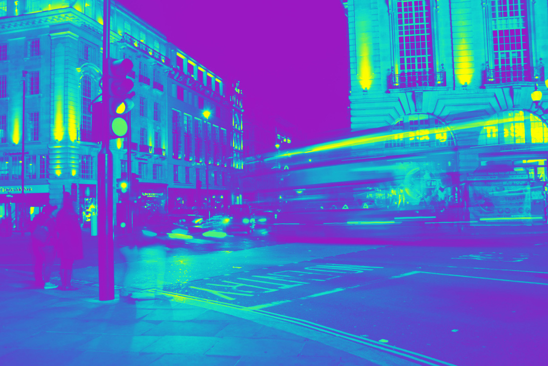
This third strand focuses on the relationship between cities and the colourful movement within them, particularly focusing on London. From previous work I had done, I knew how much I loved bright colours and editing photos to make them look extremely different to their original state, so I wanted to portray a similar style in this strand.
These two slideshows above and below show images from my shoot in their unedited and then edited form. The slideshow below shows roughly how many different edits of the same photo I did for each, and how I experimented using different colours and effects over the original images. I found that if I altered the colour of an image by placing a gradient map over it, I could change the original meaning of the photo, and create a new perspective on to what was happening in the shot. I also particularly liked how the images felt like they had a stronger emotion behind them after I had changed their colour, and wanted to develop this further to see what else I could create from normal photos.
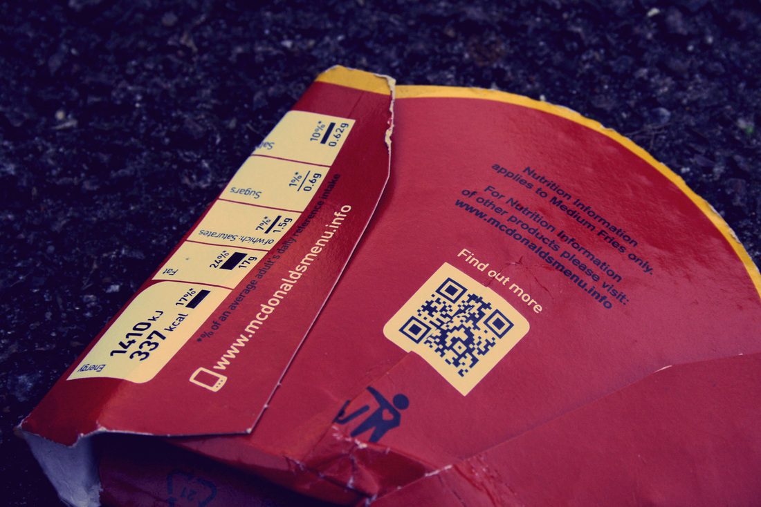
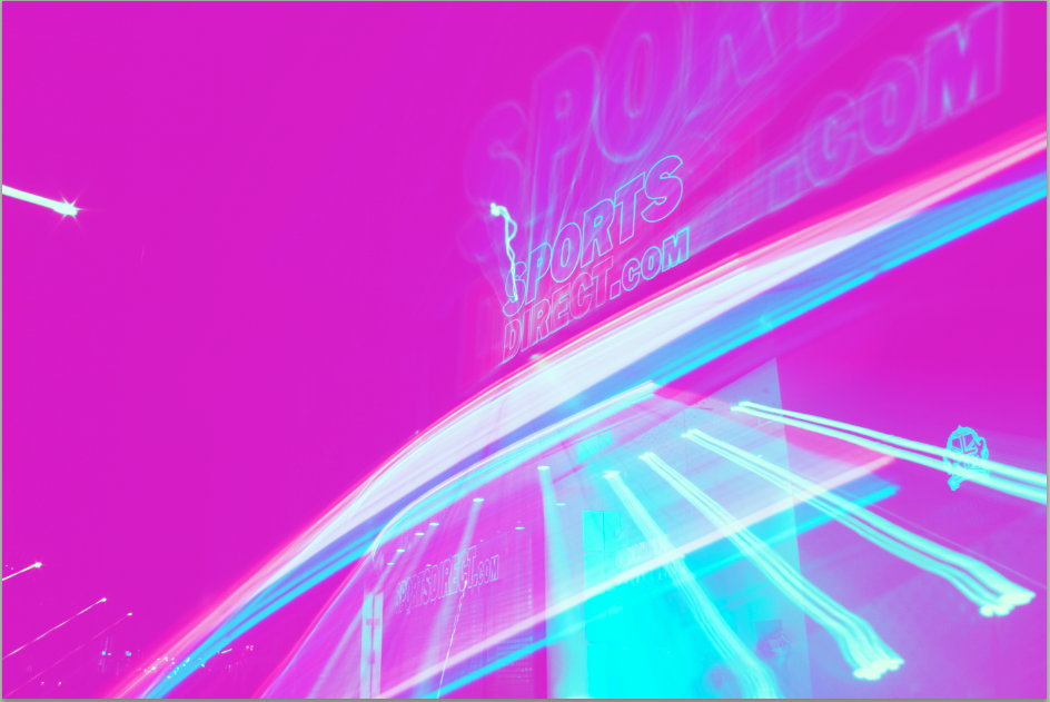
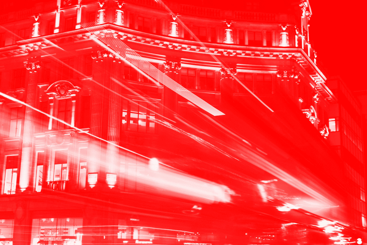
As you can see, there is blurred movement in these images. This was captured by placing my camera on a tripod and using a slow shutter speed. By doing this, I could capture shots showing cars or other vehicles moving, but still maintain still buildings or people in the same images. However, in some of the photos I used a technique called the 'zoom blur'. This is where you take a shot with a slow shutter speed and then quickly zoom in and out on your camera. You can see the difference from a normal shot and a zoom blur shot in the slideshow above in the Sports Direct and McDonalds photos. I also used a tripod with these images to prevent the whole image being out of focus or messy when I quickly zoomed in and out.
As you can see, there is blurred movement in these images. This was captured by placing my camera on a tripod and using a slow shutter speed. By doing this, I could capture shots showing cars or other vehicles moving, but still maintain still buildings or people in the same images. However, in some of the photos I used a technique called the 'zoom blur'. This is where you take a shot with a slow shutter speed and then quickly zoom in and out on your camera. You can see the difference from a normal shot and a zoom blur shot in the slideshow above in the Sports Direct and McDonalds photos. I also used a tripod with these images to prevent the whole image being out of focus or messy when I quickly zoomed in and out.
Below are my favourite edits from my shoot for my third strand. I chose to change the colour of the photo of the bus only slightly so that it did not look too different from the original. This is because I was very pleased with how the original image looked, and didn't want to cover it with a bright colour and risk losing the fuzzy lights and sharpness of it. However, I found that when I changed the colour of the Sports Direct photo to very bright colour, it suddenly appeared very different to its original.
|
|
|
|
Below are two gifs that I made where the saturation of the images is changing. Whilst I was editing this original image on photoshop, I decided to see what would happen when I changed the saturation. As I moved the slider for saturation, the colours gradually changed, and instantly I had an idea to make a gif to capture this smooth change of colours. As I had already decided that I wanted to produce images with bright colours, I thought that this gif would work perfectly alongside them. Also, the movement of colours works well to represent the moving bus in the image, and as this strand is based upon the relationship between cities and colourful movement, this gif portrays exactly that.
This gif below was also made by changing the saturation of the original image. However, unlike the one above, I had already edited this image before changing the saturation. It already had a gradient map over it with bright colours, meaning that when I changed the saturation, a wide range of colours were shown in the gif.
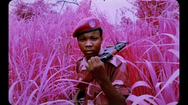
Richard Mosse
This photographer has produced both images and film capturing war in the Eastern Congo in a unique way. He has created a new perspective on the conflict by his use of infrared film, which causes plants to appear pink.
His work has inspired me with altering the original colours of images to provoke new meanings and thoughts in to them.
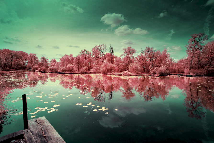
David Keochkerian
This is another photographer who inspired me with my images for this strand and then my final development. I particularly like his choice of colours within his images. In most of his work, photos will feature two main colours, that have been chosen to perfectly work alongside each other. I particularly liked this, where colours were chosen to enhance an image and make viewers question the meaning and interpretations that could be taken from images.
This alteration of colour can produce 'fake realities', where places appear like they are from a fiction fantasy. As you can see below, Keochkerian has produced images with brightly coloured trees, that are obviously not real. Yet this alteration allows us to explore our imagination, thinking about what it would be like if a place like that existed. I wanted to try and replicate this effect from the use of different colours in my final development, to hopefully create a similar feeling and provoke unique thoughts from my images.
|
|
Final Development
My final development is based on the relationship between the life and colour within a city.
I have produced work which shows two cities from unique perspectives, portraying them in an altered reality by using bright colour pallets to represent the emotions and culture that runs throughout them.
I have produced work which shows two cities from unique perspectives, portraying them in an altered reality by using bright colour pallets to represent the emotions and culture that runs throughout them.
|
|
Contact Sheets for First Shoot of Final Development
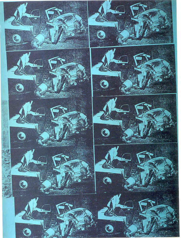
Andy Warhol - Death and Disaster
I was inspired by the bright colours and layout of Andy Warhol's 'Death and Disaster' series. His repetition of the same photo makes viewers see them in a unique way, as it provokes new meanings and perspectives. This series of work was produced using silk-screenprinting, allowing him to repeat and add colour to photos, which also gives them a mass-produced and impersonal effect.
Warhol wanted to portray a specific message behind this series. He is famous for producing images of soup cans or famous icons in repetition, but this series was is less well known. By showing images related to death, including a gruesome car crash in repetition, he is demonstrating how images like this are actually as common to us as soup cans. He is commenting on how the more we see something, the more desensitized we become to it. Warhol is displaying very negative images, but has altered their appearance by putting them in repetition and in bright bold colours. What is actually hapenning in the photos is hidden and muted by this editing, showing how in the modern world, we have lost a sense of emotion towards negative events, e.g. death, as a result of these types of photos becoming common to us.
Even though I knew that I did not want my final development to portray a similar message to this series, I was still heavily influenced by it. I wanted my work to show images in a new light, like Warhol's, with an altered meaning to the original. I was particularly fond of the idea of portraying something in a different unique way, making viewers question what it represented in an image.

|
|
Below are three series of images set out in a four-square layout. After seeing what different images looked like with different colours, I realised that I could lay them out all together as a collage. This is inspired by Andy Warhol's work above.


I experimented with placing different gradient maps over images, including brighter ones such as above, and darker ones such as below. Whilst all three sets feature movement, showed by blurred cars, buses and people, the different colours portray my chosen relationship in a subtly different way. At this point after editing these three sets of images, I was deciding how I wanted my final piece to look, in terms of colours and composition.


|
|
|
|
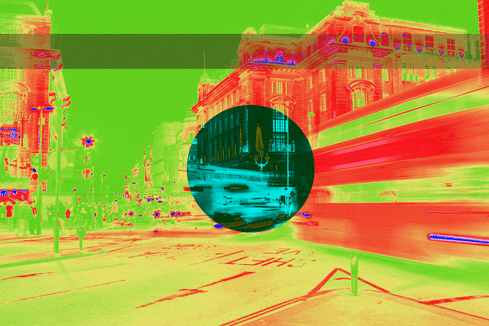
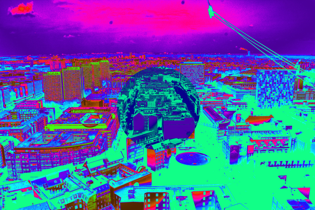
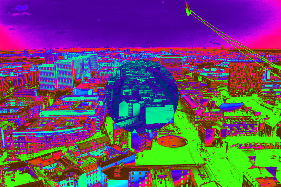
Keisuke Shirota
This photographer inspired me to add another layer to my photos. They have produced work where only a square in the center of the image is in colour, and is sometimes blurred. This adds a unique quality to their photos, and instantly draws attention to the centre, then making viewers think about the relationship between the main focus (the centre) and the surrounding.
I wanted to replicate something similar to this with my final development, so decided to add a circle layer in the center of my photos with a different gradient map, as you can see further down.
|
|
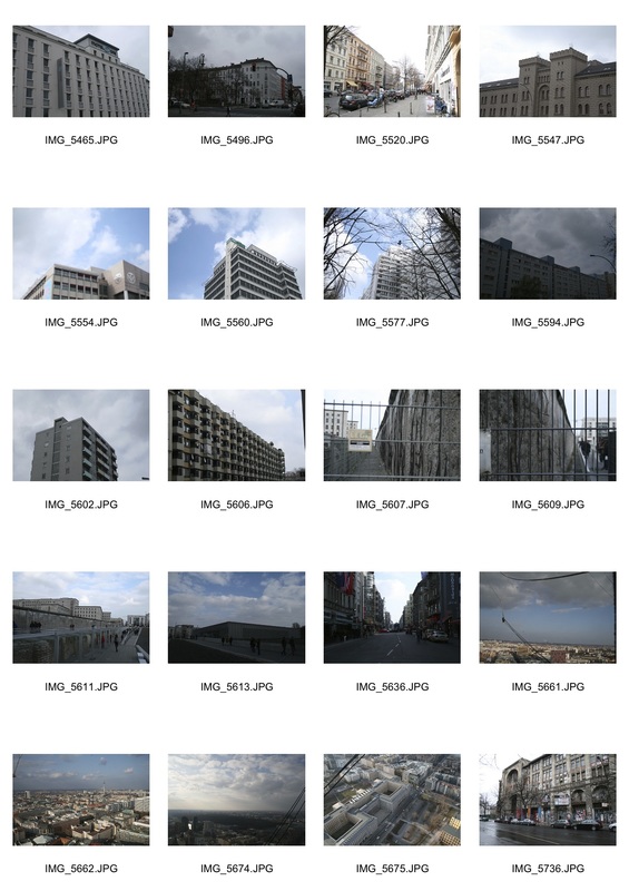
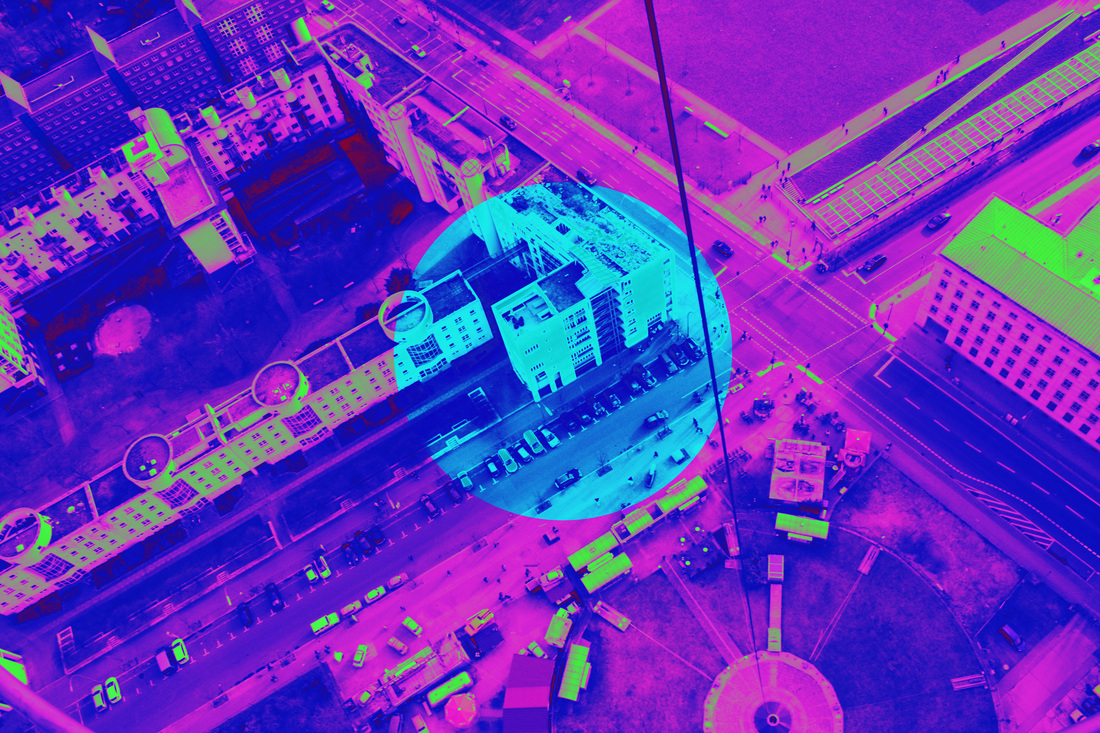
Berlin Contact Sheet
|
On the left is a contact sheet of photos I took on a trip to Berlin mid-way through working on this strand. During my time there, I noticed a lack of colour that ran throughout the city after it had been divided up during the Second World War. I saw this lack of colour as a metaphor of the life that had been sucked out of the environment when it was divided up.When the wall came came, culture, art and vibrancy returned to the city and I thought this could be represented by the influx of new vivid colour. Even though many buildings appeared unfinished, and were painted a dull grey colour, there was still a strong sense of art and culture present in the city. For this reason I decided that I wanted to capture shots of the grey architecture, and take photos of the bland buildings to then edit on photoshop. As I had edited photos previously in my third strand by changing their colours so that they looked bright and abstract, I thought that I could do the same for images taken in Berlin. This way I knew that I could explore the relationship between life and colour, especially within cities, and create images which showed an altered reality, making places look very colourful, when really they are dull and grey coloured. Upon my return to London I wanted to continue with the theme of life and colour within a city.I was excited to explore this relationship, and see what I could create from images in two cities, London and Berlin, to then compare and see if a similar feeling would be given off from my edits.
|
I experimented with many different gradient maps over my photos, including the very abstract three below which use an extreme range of bright colours. Whilst at first I was very excited by this huge range of colours, with the image containing a large amount of detail, I then decided that it was too intense. Although I loved the brightness of these images, I realised that it detracted meaning from the original shot, and made you think about the colours rather than the actual shot and architecture visible in the photo.
|
|


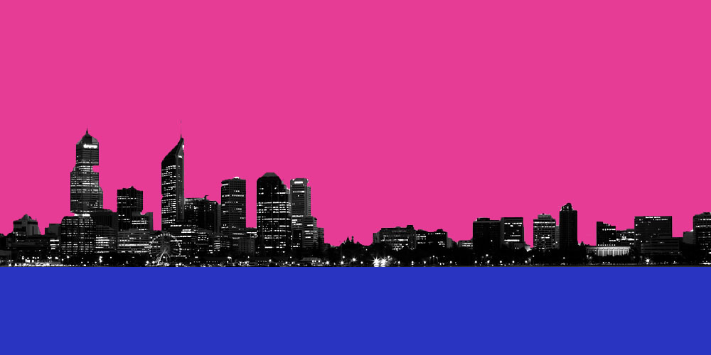
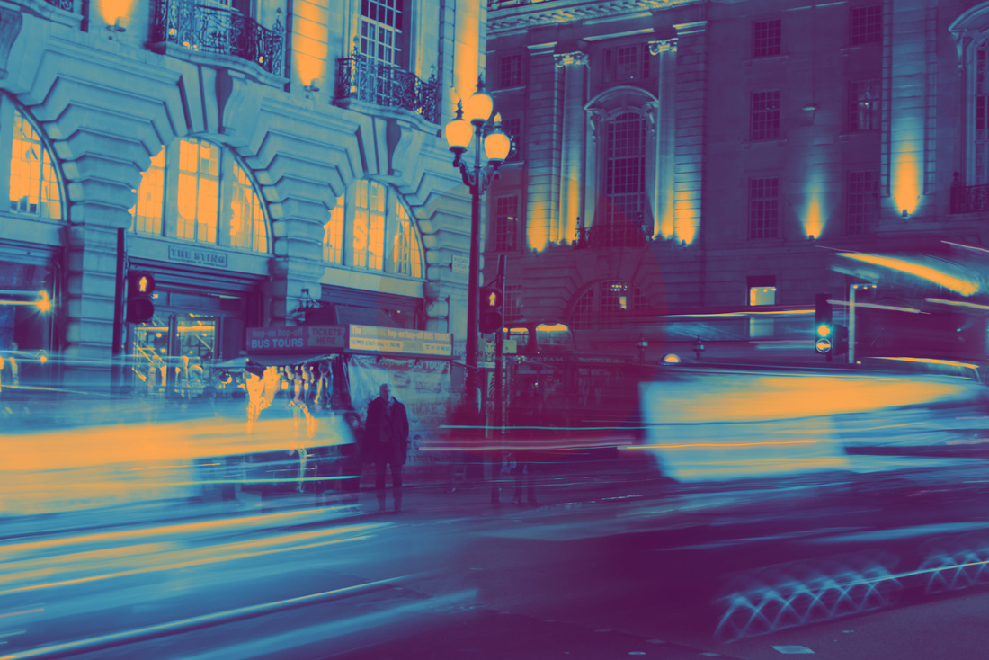
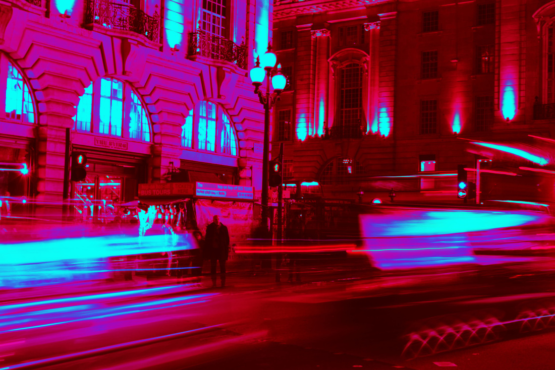
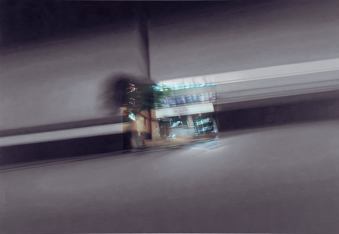
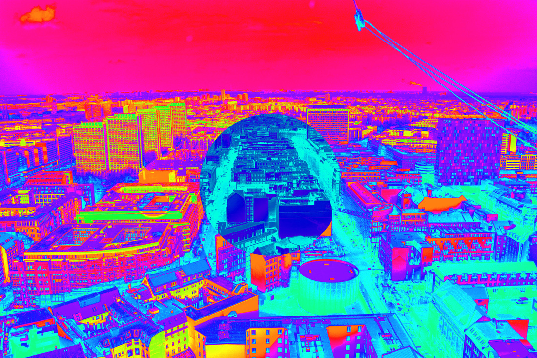
Final Piece
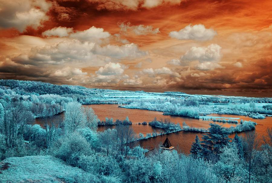
Both the image directly above and below were taken in Berlin whilst I was on a hot air balloon. I was able to capture panoramic shots over the whole city, and get a unique perspective of the architecture and design of the city. As mentioned earlier, they portray Berlin in an altered reality, showing the relationship between life and colour throughout a major city.
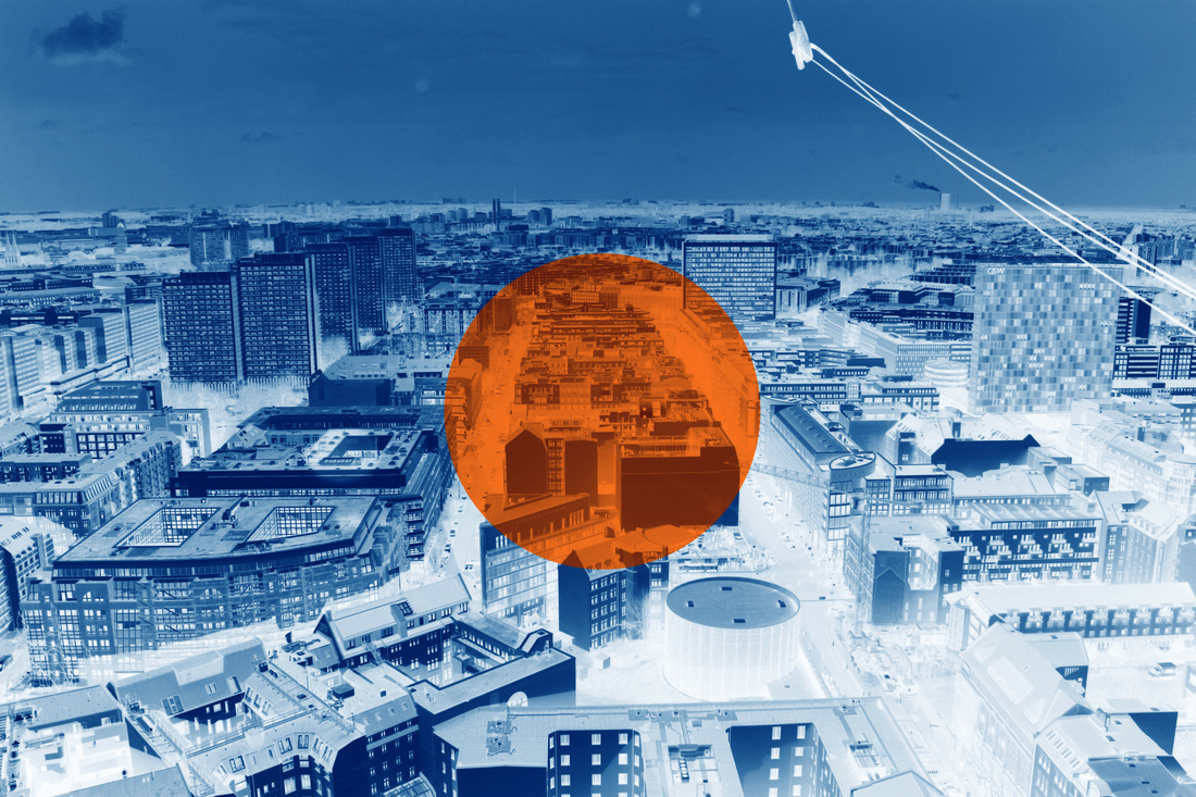
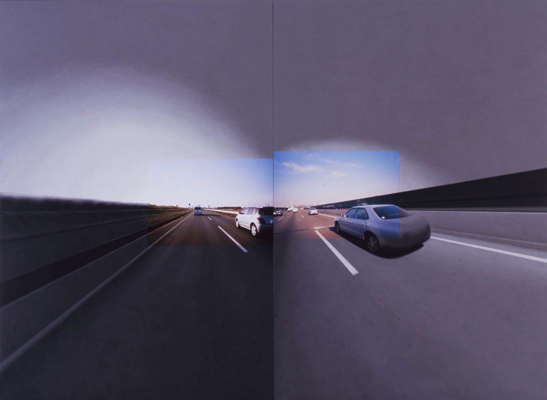
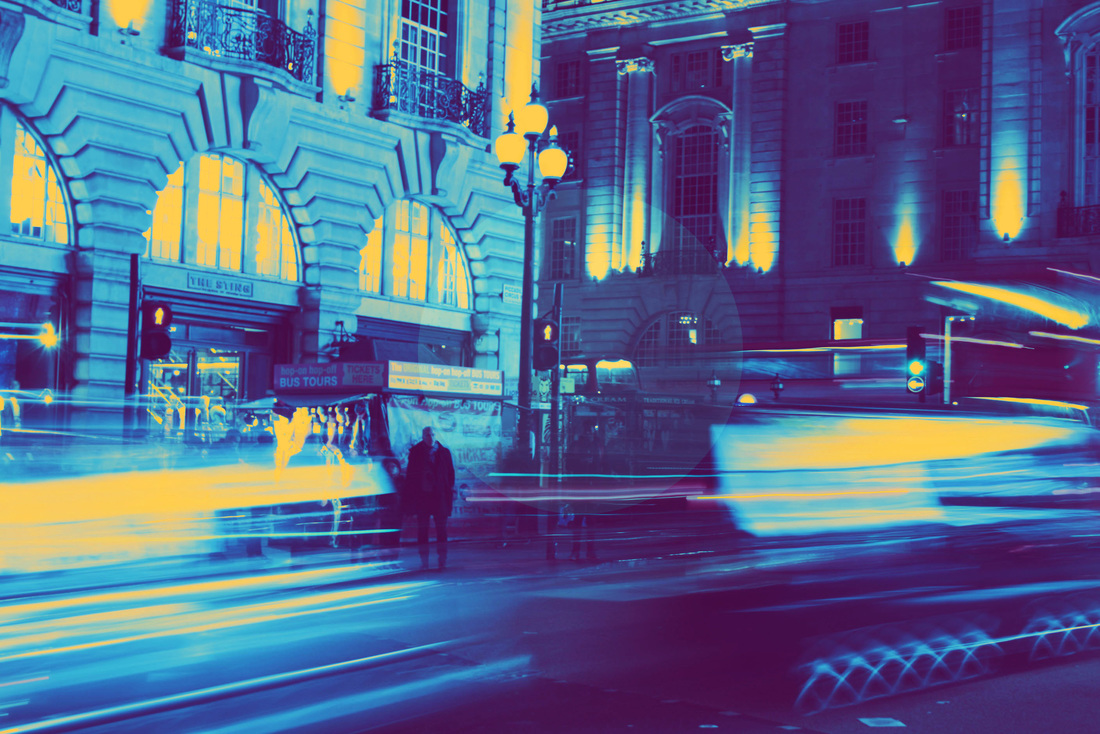
The image directly below was taken in London by Piccadilly Circus. I was very lucky with this shot as I managed to capture moving cars at a good time. This allowed the composition of my photo was perfect for what I wanted to achieve. As you can see, I added a very subtle circle layer over the top of the image to add a unique quality, which was inspired by Shirota (mentioned above).
Below are the original photos that I used for my final piece as shown above.
You can see from the Berlin shots how the real colours are much duller and darker, making it more clear how I have enhanced the city's true colours to represent the culture that is not so present at first glance.
You can see from the Berlin shots how the real colours are much duller and darker, making it more clear how I have enhanced the city's true colours to represent the culture that is not so present at first glance.


