PORTRAITURE
A portrait can represent a number of different things, but is usually an image unique to someone/something. This section of my weebly will display different artists and photog
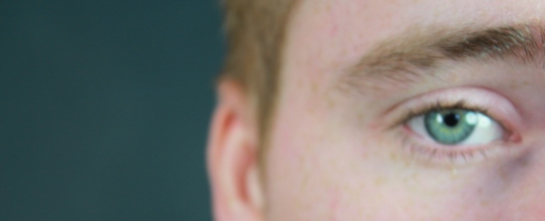
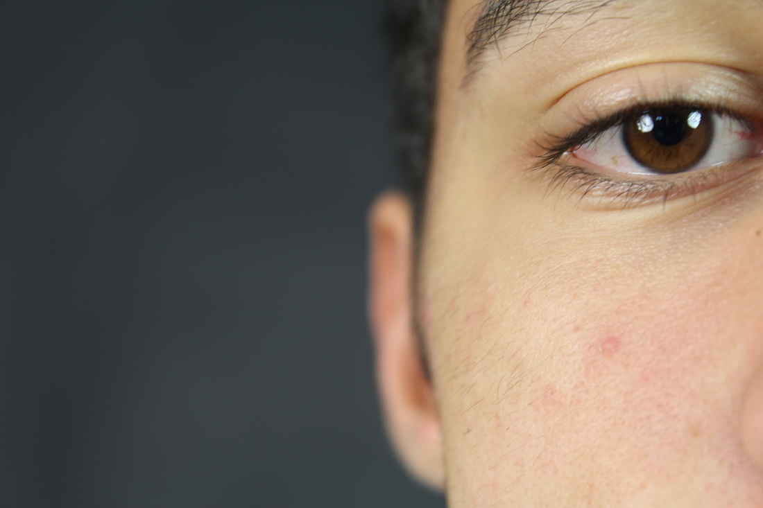
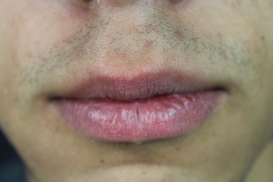
Myra Greene - Character Recognition
Myra Greene is a photographer who created a piece of work titled, 'Character Recognition'. This project focuses on different parts of her face, resulting in interesting and unique photographs that suggest ideas of exploration and identity. She wanted to portray an accurate visual representation of herself that reflected her ethnic features and background. Greene used a photographic process to produce these photos that is linked to the times of ethnographic classification. They have been printed on to glass, which gives a specific style of image, emphasising and enhancing the different textures and shades of her face.

|

|

|

|
Close Ups
|
|
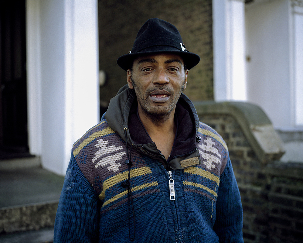
These photos are inspired by the work of Myra Greene. I found that it was quite difficult to take these close ups as the camera wouldn't always focus when I wanted it to. However when it did, the photos show interesting angles and textures that are unusual as most portraits simply capture a whole face straight on. The images also give a different perspective of people that you would not always see normally. The photos above are of members of my class and the one below are of my parents.


Three Different Environments
The photographs above capture three different environments in my school, including the security guard at the front gate, the office, and the canteen. When taking these photos, I tried to capture the environments in an unusual way, but then at the same time still represent the workers how most people see them. Each environment was quite different from one another, so I had to think differently when taking photos yet still capture all of them in a similar style. Also, at first glance, each environment seemed quite dull as they featured a lot of bland colours, and didn't seem to have anything interesting to capture. So I decided to try and capture these dull colours and little action in the best way I could that would almost emphasise this in a way, making it clear to viewers exactly what these environments are like. One difficulty that I had was changing the settings on my camera for each different environment, as the lighting was very different for each. For example, the security guard's cabin at the school gate was outside, whereas the office was fairly dark inside. This meant
Visual Picture: My Mum
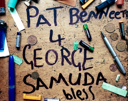
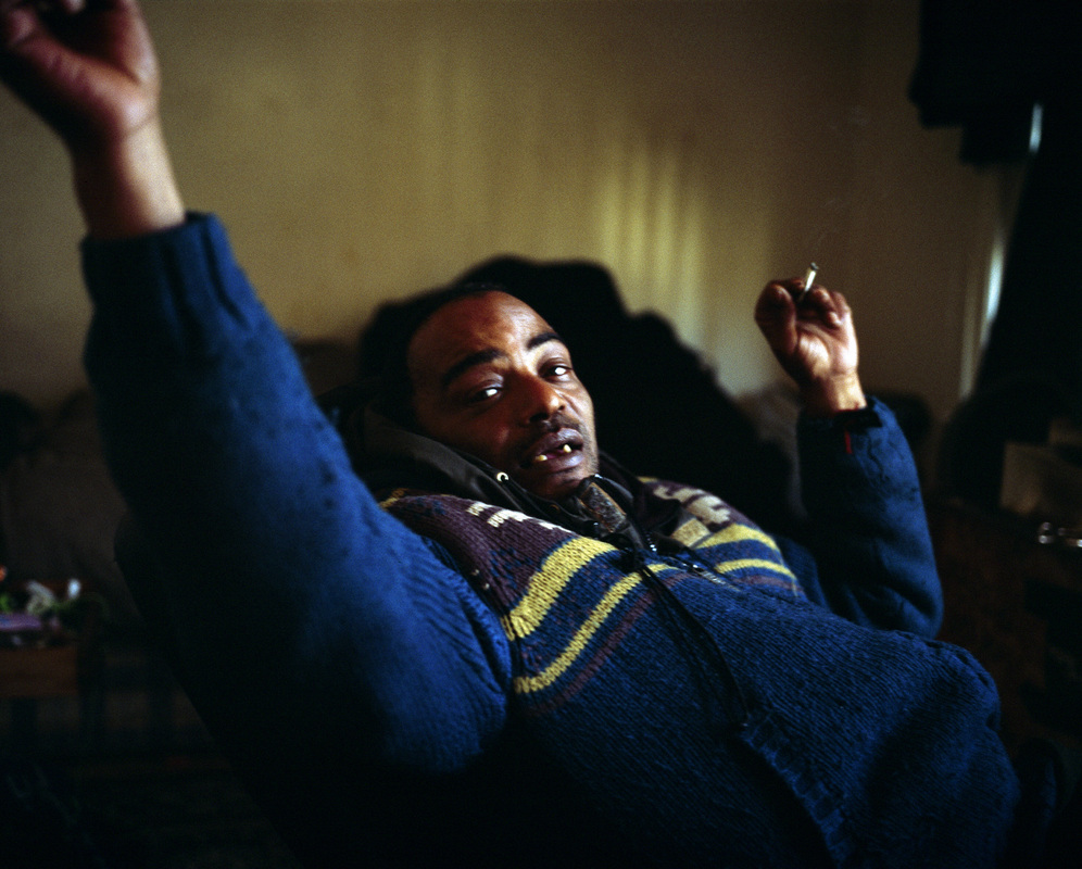
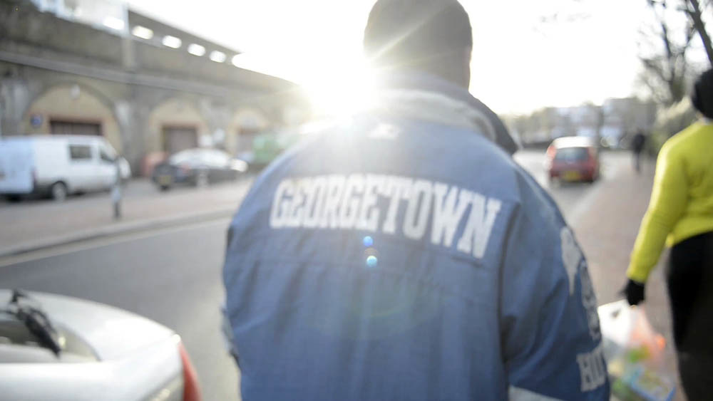
This collection of photos was inspired by the work of Lewis Khan. He produced a short film and photographs, 'Georgetown', about a man he met in his local area called Pat Bennet. The film features portraits of Pat and various objects in his flat in South London. Whilst the film is quite mysterious as it doesn't fully portray Pat Bennet, viewers still get a strong sense of his personality, simply from the objects we see, and his local area. He comes across as a very interesting and unique character, and Khan's style and angles of shots strongly emphasises this. Khan uses a range of angles, ranging from close ups of Pat Bennet's mouth whilst he talks, to video portraits of him standing still in different places in local area, with the moving background behind him.
The photographs above are of my mum and objects that she uses frequently. Like the photos of the three different environments above, I tried to capture my mum in settings that I often see her. For example, working in the study, or reading on the sofa. I also took close up pictures of items that she uses including her phone, stationary and her mug. At first I found this task hard to do as it wasn't easy thinking of how I could capture my mum doing her normal every day things in an interesting way. But then I decided that I would try to take some photos to exactly represent I see her through my own eyes, and some from unusual angles to get a wider perspective.
The photographs above are of my mum and objects that she uses frequently. Like the photos of the three different environments above, I tried to capture my mum in settings that I often see her. For example, working in the study, or reading on the sofa. I also took close up pictures of items that she uses including her phone, stationary and her mug. At first I found this task hard to do as it wasn't easy thinking of how I could capture my mum doing her normal every day things in an interesting way. But then I decided that I would try to take some photos to exactly represent I see her through my own eyes, and some from unusual angles to get a wider perspective.
Below is the film 'Georgetown', by Lewis Khan.
Georgetown from lewis khan on Vimeo.
Below are stills from the film 'Georgetown', by Lewis Khan.
|
|

|
I particularly like this photo as it says a lot about Pat Bennet, even though it is simply a photo of his objects on his table. The objects are not ordered in any way at all, and looks like Khan has captured them exactly how Pat left them. Viewers see the casette tapes and cds and immediately understand that he is in to music. They also see the lighters, ash tray and rizla, so learn that he is a smoker and drug user. Even the messiness and untidiness of the table suggests how Pat takes care of his flat. I really like the mix of colours in this photograph.
|
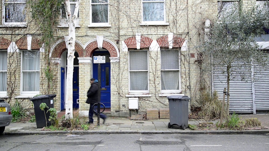
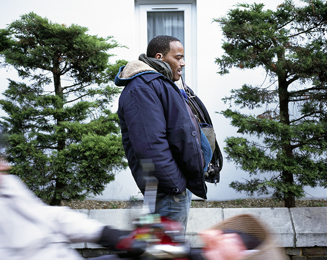
Khan has captured the character of Pat Bennet in a very unique way. Viewers of Georgetown and the stills immediately get a very strong sense of what he is like. Even though Khan has used unusual angles and his unique style to represent him, we still get a very strong understanding of his personality. I particularly like the symmetry used in many of the both stills and film portraits of him, where he is either walking or standing on a street in his local area.
Face Merge
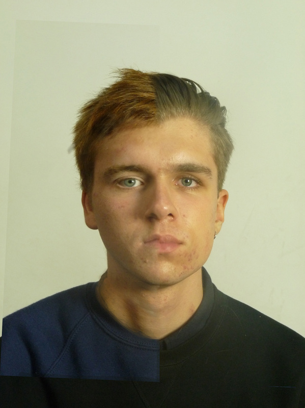
This photograph below is inspired by the work of Ulric Collette. She produces interesting photos, where she merges two different faces together, to create one lifelike, yet strange face. Many of her 'face merges' have been of different family members, which allow you to see both differences and similarities between them. The photo below is of me on the right and my classmate Sam on the left. I used Photoshop to merge our portraits together. It was not at first easy as our faces are different proportions, so making each half of our faces look like one face was a challenge. It was also my first time using Photoshop, but once I got the hang of it, it wasn't too hard to use the program to do what I wanted.
I started by leveling our eyes so that they were a similar size and looked balanced. Nearly everything that I did with this face merge involved me changing Sam's face so that it matched mine, so I kept mine the same, and altered Sam's so that they matched in shape and proportion. After leveling the eyes, Sam's face was still a bit bigger and taller than mine, so I altered it so that it was the same height and width as mine. I tried to make our chins blend together as much as possible, as at first they were very obviously different because they weren't level with each other. The same problem was also true with the top of our heads.
When I had managed to get our heads to look a similar shape and proportion, it began to look more like a professional face merge, and looked more realistic. However, there was still a clear straight line across the middle where our faces joined. To get rid of this line I used the rubber tool, where I could rub out sections of Sam's face that were on top of mine. This allowed me to blend the middle of our faces together, making the picture look more like one face. I used this tool all around the middle, apart from our jumpers. It was much harder to achieve a natural looking blend on our hair due to the difference in colour. Even when I used the rubber tool along the middle where our faces joined, it still looked very unrealistic, so I decided to blend it diagonally to make it look more natural. As both of our hair went to the left, it looked slghtly better when I blended the hair in a diagonal line going to the left.
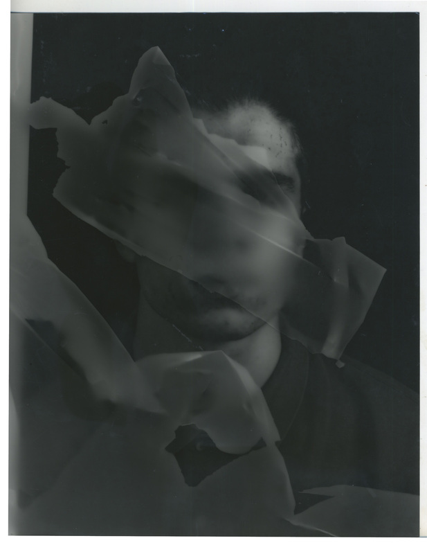
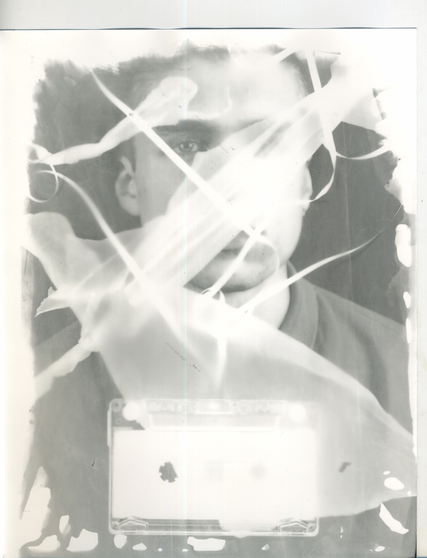
Sayako Sugawara - Cyanotypes

These photos are inspired by the work of Sayako Sugawara, an artist/photographer who specialises in manipulating photographic images and seeing how these processes can bring new meanings to these images.

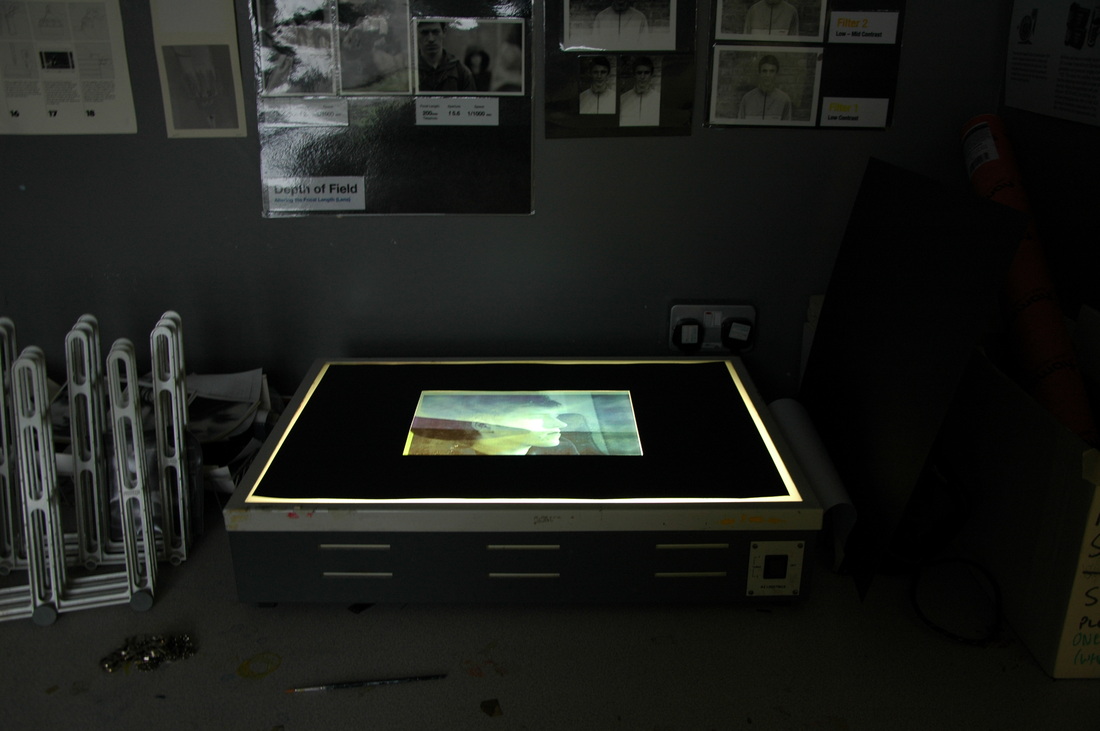
I made the image above in the dark room. First, I placed a negative of another person studying photography on top of a sheet of light-sensitive paper under an enlarger. Then I got some fabric and tracing paper and scrunched it up, before placing the different sheets under the negative image. I then exposed the light-sensitive paper under the enlarger for 5 seconds.
After soaking the paper in the three chemicals, 'develop', 'fix' and 'stop', and drying it, I was very happy with the final result. The fabric and tracing paper over the person's face creates a mysterious effect as it nearly covers his whole face. The fabric and tracing paper also created different interesting textures and shades of colour, which are highlighted by the picture being in black and white.
After soaking the paper in the three chemicals, 'develop', 'fix' and 'stop', and drying it, I was very happy with the final result. The fabric and tracing paper over the person's face creates a mysterious effect as it nearly covers his whole face. The fabric and tracing paper also created different interesting textures and shades of colour, which are highlighted by the picture being in black and white.
|
|
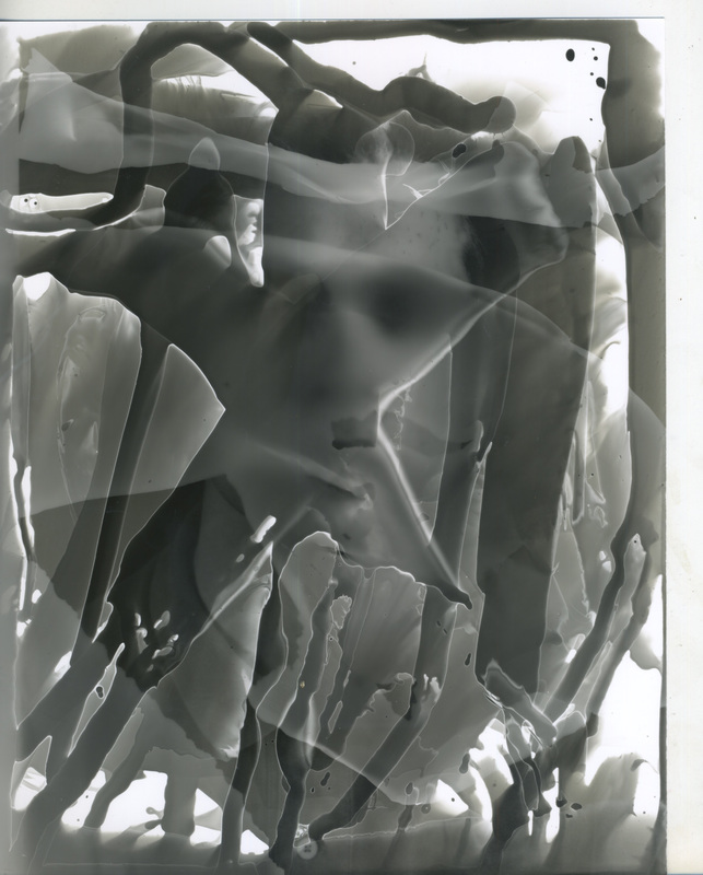
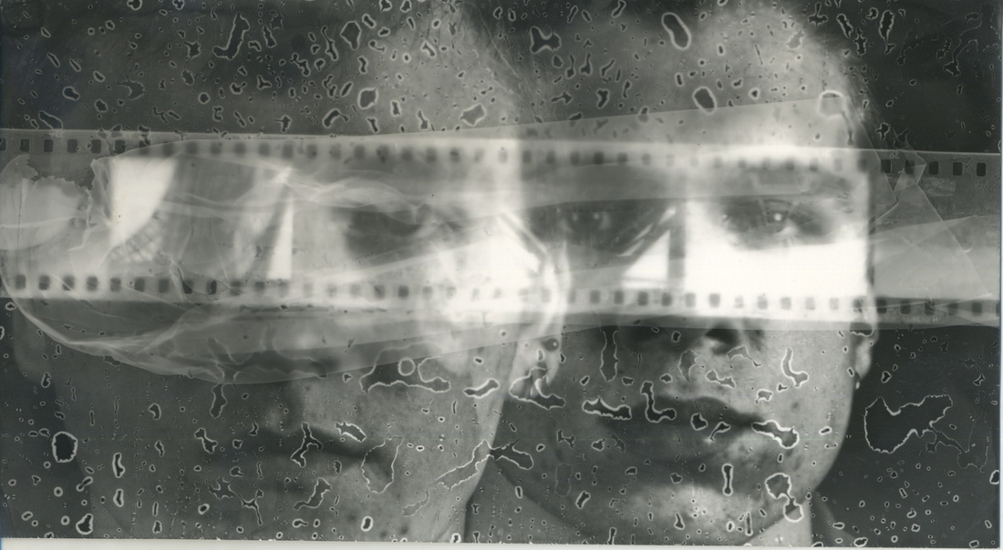
The two images above and one below were also made in the dark room, but this time were created using the same self-portrait. The one on the top left was made by me placing different pieces of tracing paper on top of a negative of myself. I exposed the image using the enlarger for 5 seconds (as I had done before), but it ended up going darker than my previous image. Nonetheless, I was very pleased with the end result and actually really liked how dark the image was. The dark colours added to the already mysterious quality of the image created by the tracing paper covering my body and face. I also like how with this photo, the tracing paper was not too thick, so it blurs my face and body underneath it, so you can only just see what is underneath.
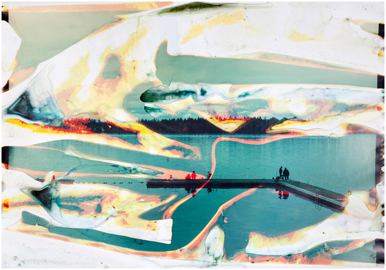
The photo on the top right was made in a similar way, however, I placed different sheets of tracing paper underneath the negative of myself, and instead of soaking the light-sensitive paper in the 'develop' chemical after exposing it, I brushed on the chemical on to certain sections of the paper, and allowed it to drip. This created a very interesting effect, as many different shades of colour showed up, and
The photo on the top right was made in a similar way, however, I placed different sheets of tracing paper underneath the negative of myself, and instead of soaking the light-sensitive paper in the 'develop' chemical after exposing it, I brushed on the chemical on to certain sections of the paper, and allowed it to drip. This created a very interesting effect, as many different shades of colour showed up, and
Matthew Brandt


Lucas Simoes


Final Piece


23rd April
Finish off annotation and show how link links between each section more to show process and build up to final piece.
Add response to Lewis Khan
Finish off annotation and show how link links between each section more to show process and build up to final piece.
Add response to Lewis Khan
