Summer Task
Below is a short film I made during the summer holidays. It involves a journey across the new London 'Air Line', a cable cart transport system that goes from one side of the thames to the other. I wanted to capture modern London transport and commuting in this video, and chose music to match the feel of the busy city portrayed in the film.
AIR LINE
Air Line from Jake Franks on Vimeo.
BRIEF
Create a collection of images through photographing anti-fashion in a range of urban environments and landscapes.
First Shoot
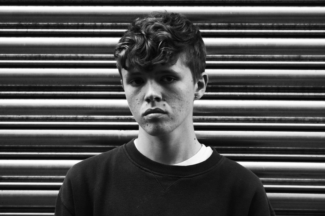
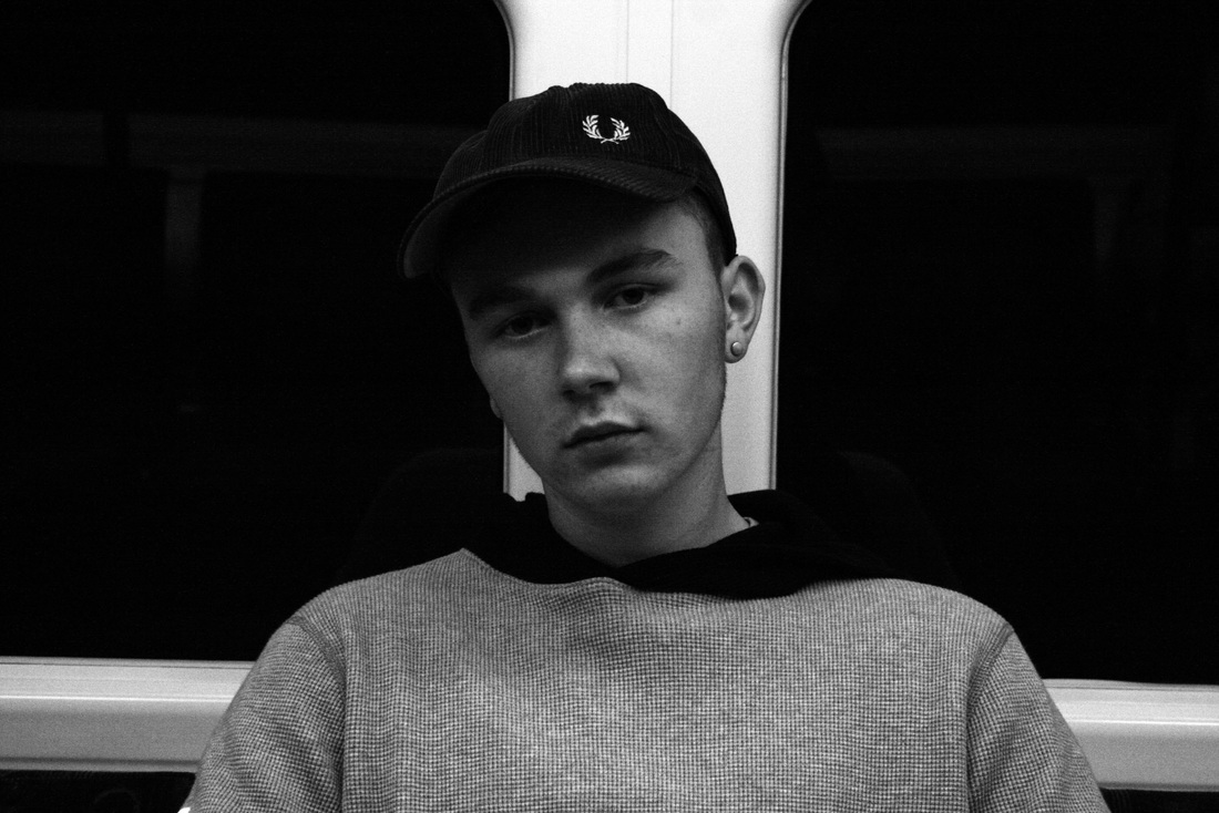
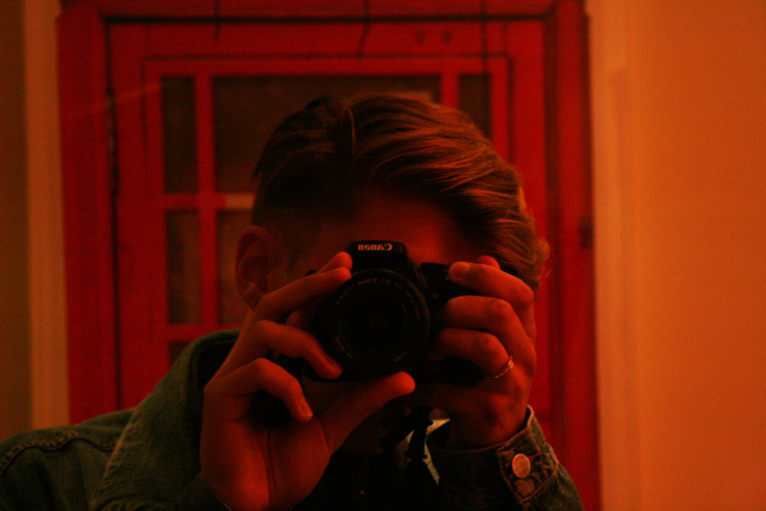
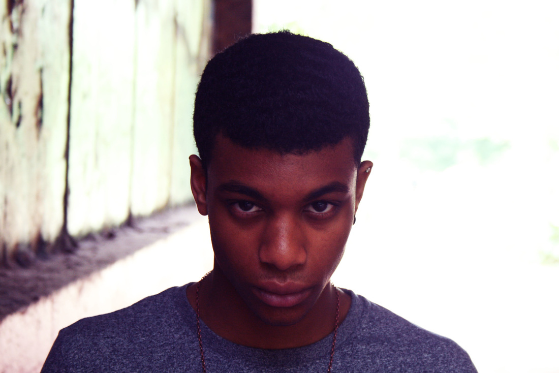
This photo was inspired by the work of David Bailey. He became famous for shooting famous icons in a very simple and upfront way, in black and white. For my shot, I posed my model in front of a steel roller door. I knew that this would act as a subtle yet effective background the shot as it would be a unique pattern to be behind my model. As the image is in black and white, the contrast of shade is highly emphasised. I chose to take this photo at a time and place where the perfect amount of natural light would hit the model's face. Unlike Bailey's shots, this image was taken outside, so there was no controlled lighting used. Also, Bailey used older film cameras to produce his work, whereas this image was taken on a DSLR. I chose to do this as it would give the shot a modern look to it, and provide more clarity. I then imported the raw image in to photoshop and altered the brightness, contrast, and set it to grayscale (providing the black and white). This shows how I took inspiration from an older artist and his style, and recreated it in a modern way, yet still maintaining the style and aesthetic of Bailey's work.
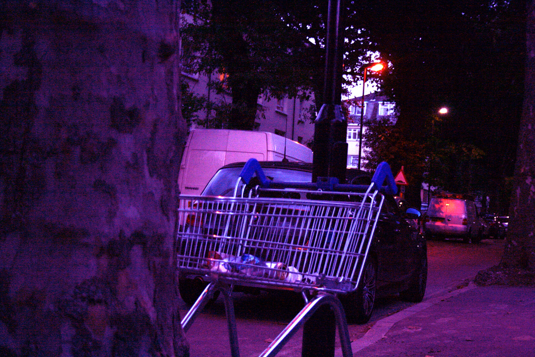
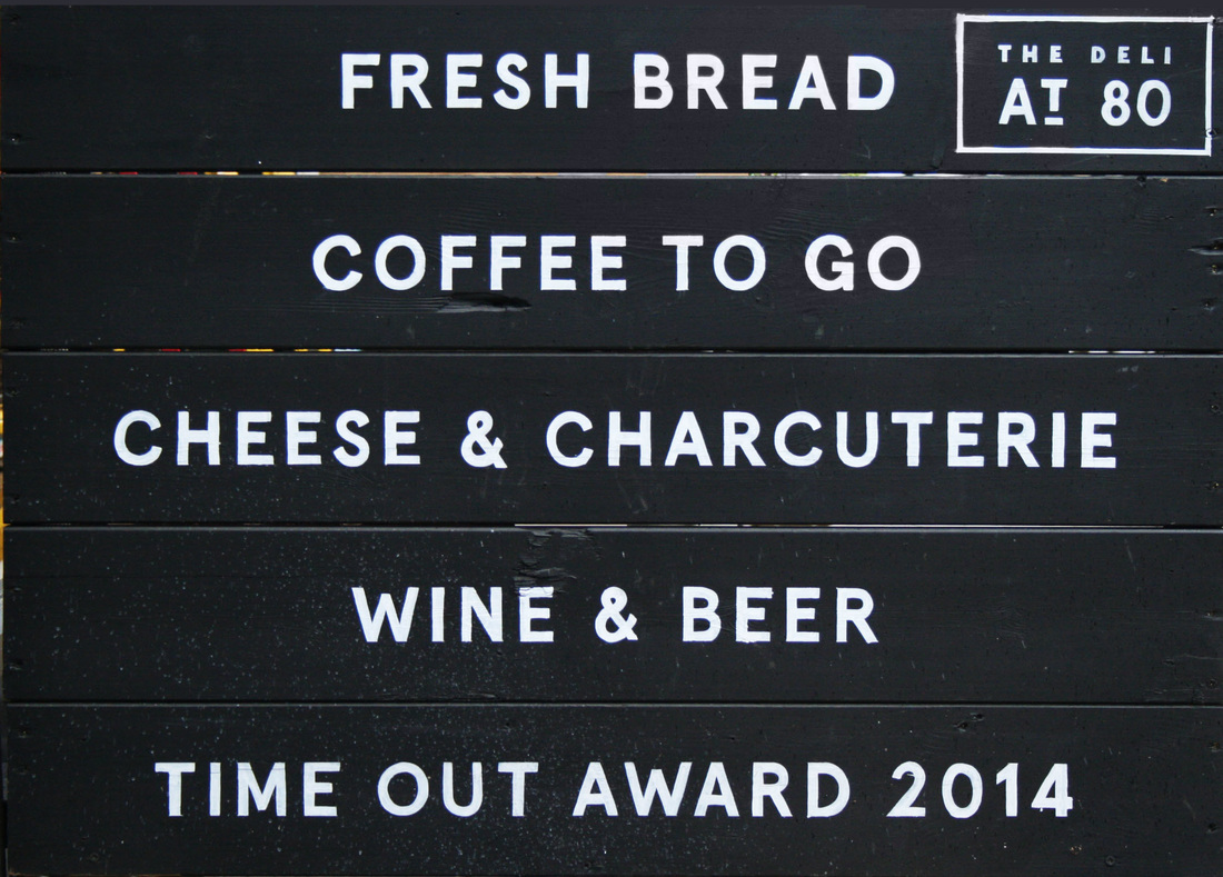
The image above depicts a certain side to London society. An abandoned shopping trolley with litter and beer cans in it, left on the middle of a street within an estate. In the background is a white van, iconic of modern 21st century culture in the UK.
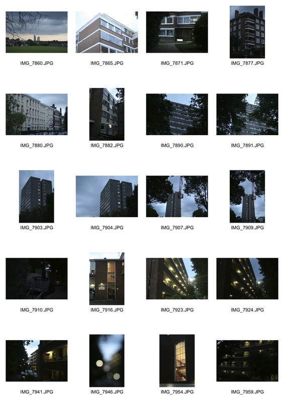
Estate Living Contact Sheet
|
|
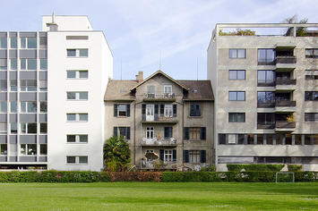
The regularity in the architecture of this block of flats can be used as a metaphor to describe aspects of modern society and culture.
|
|
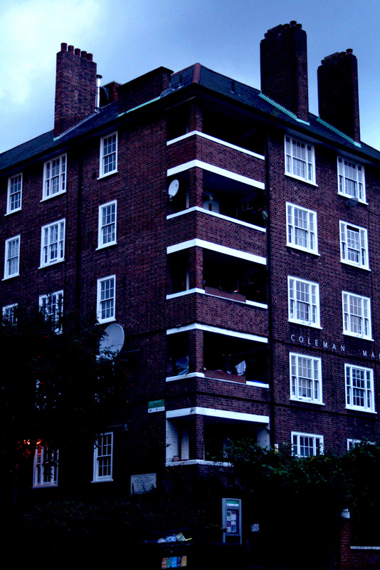
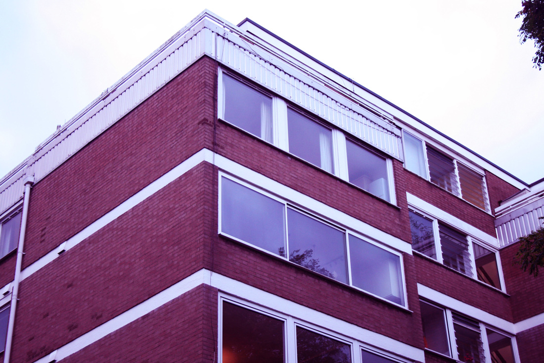
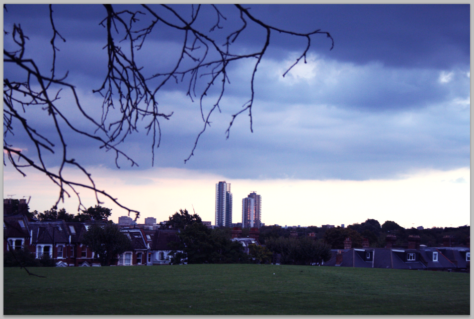
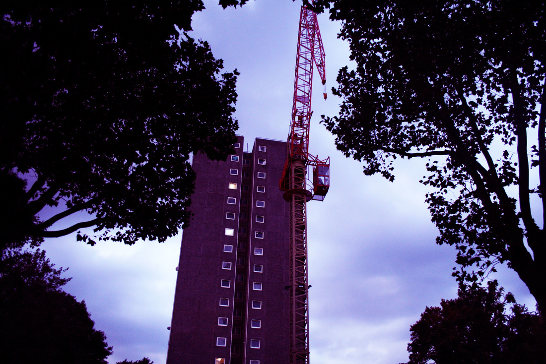
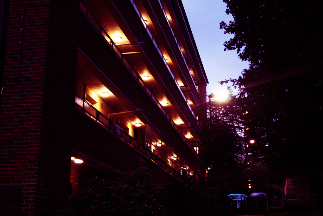
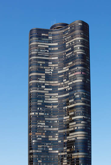
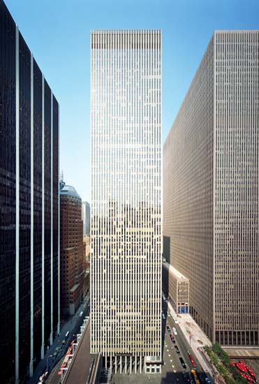
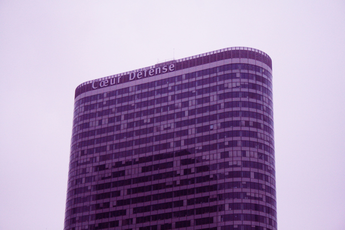
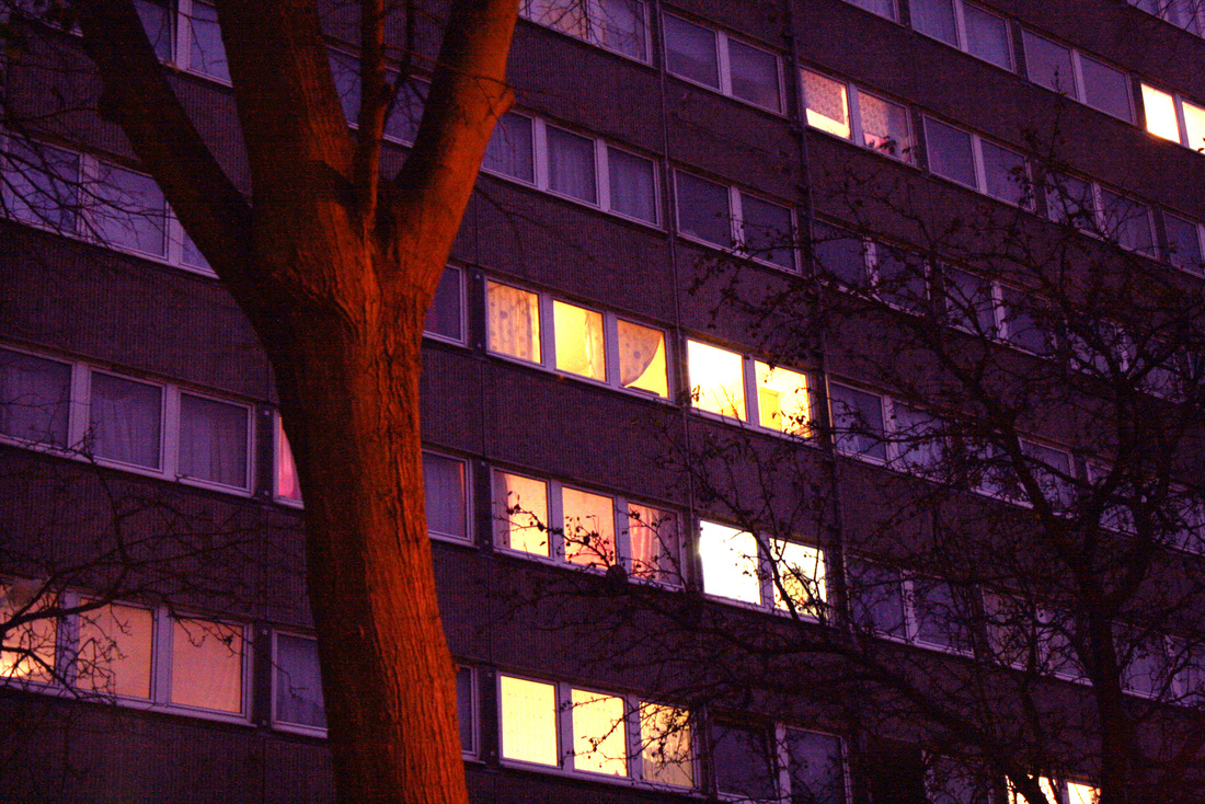
The architectural shots above and below are intended to capture the feel of living in an urban environment. These buildings appear on first glance to be fairly modern, but after a prolonged look, you notice that they are becoming outdated with the rise of new skyscrapers with sleek designs. This is due to their 1960s design aesthetic, with brown bricks and rows of symmetrical square windows.
|
|
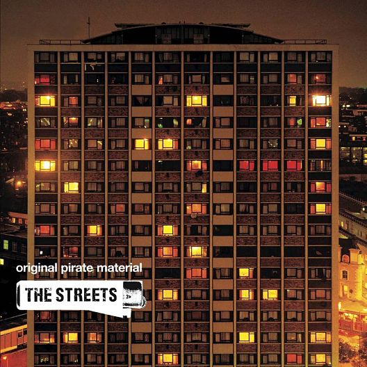
Rut Blees Luxemberg
The photo below was taken by the photographer Rut Blees Luxemberg. He created a series of architectural photos that have become well known as one shot was used for 'The Streets' album cover art (see below). Whilst this shot is simply of a block of flats, it perfectly captures the mood of a large part of 21st Century urban culture.
|
|
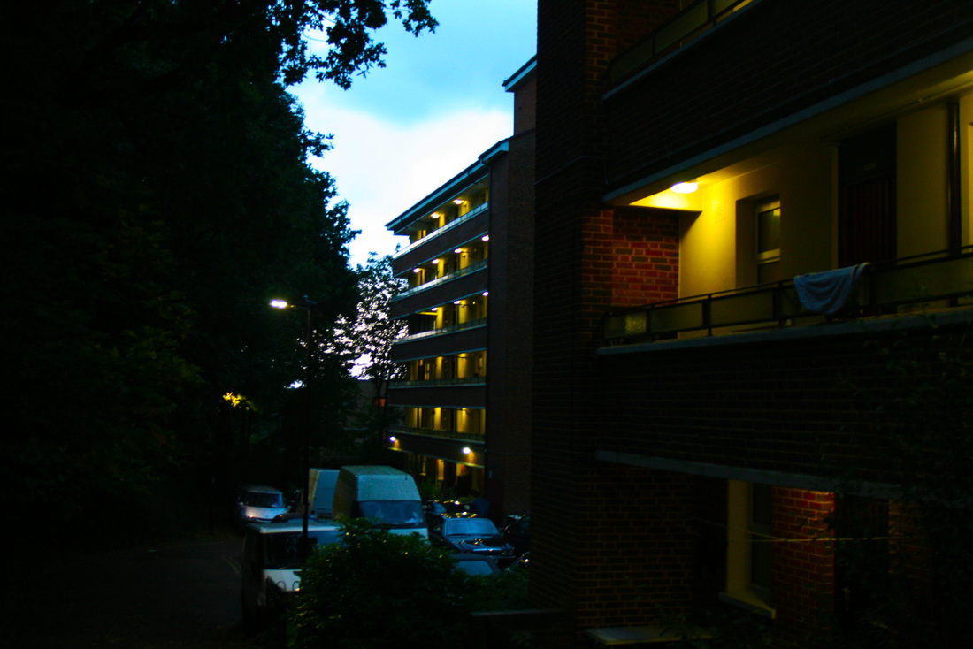
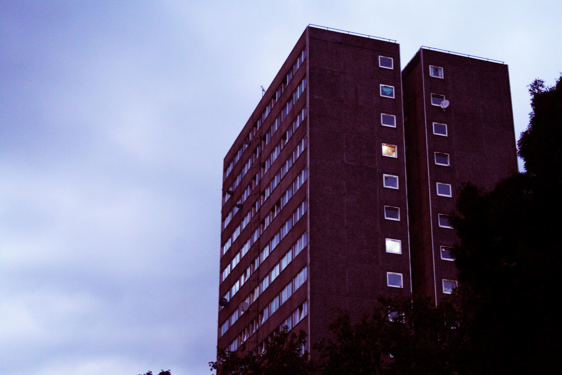
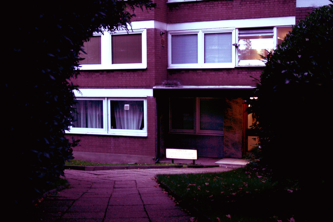
The images above are my favourites from the shoot. When taking them I considered how the composition would be highly important to capture the mood these buildings portray. For the shot above, the dark leaves of the trees contrast against the blue sky, causing the flat block in the middle to stand out. For the shot below, I chose a perfect time of day to capture this block of flats. I went to the location just before sunset so that the sky would be fairly dark, but not completely so that the streetlights and flat lights would stand out.
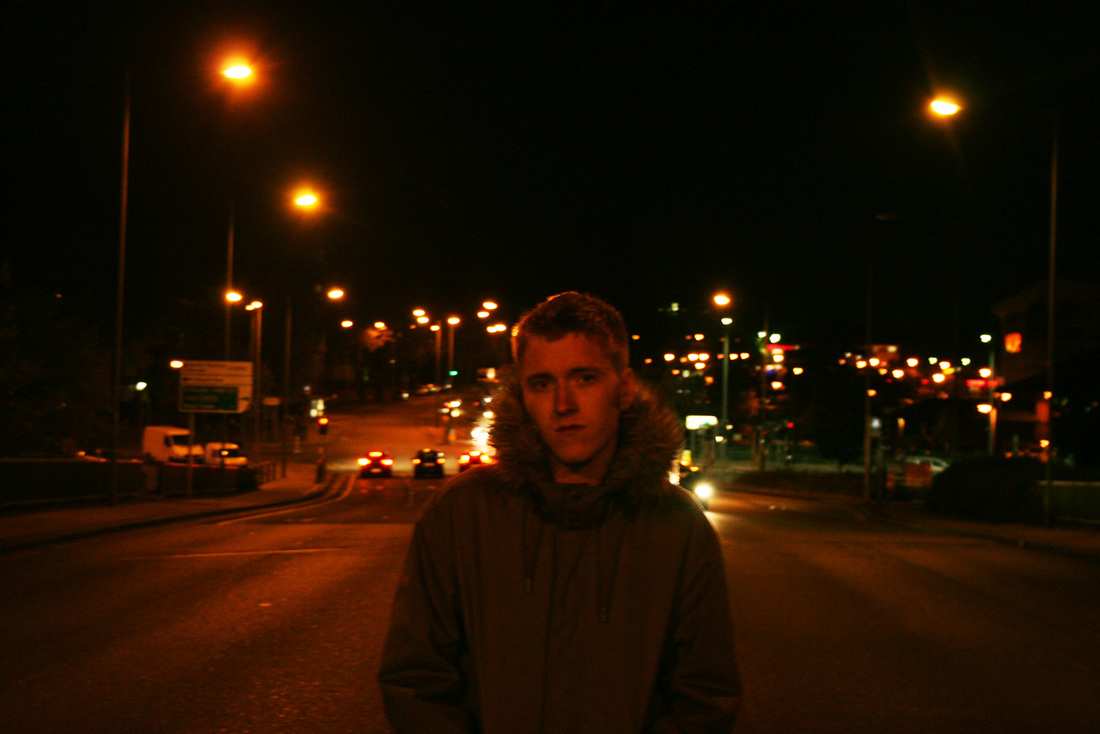
Second Shoot - Night Road Portraits
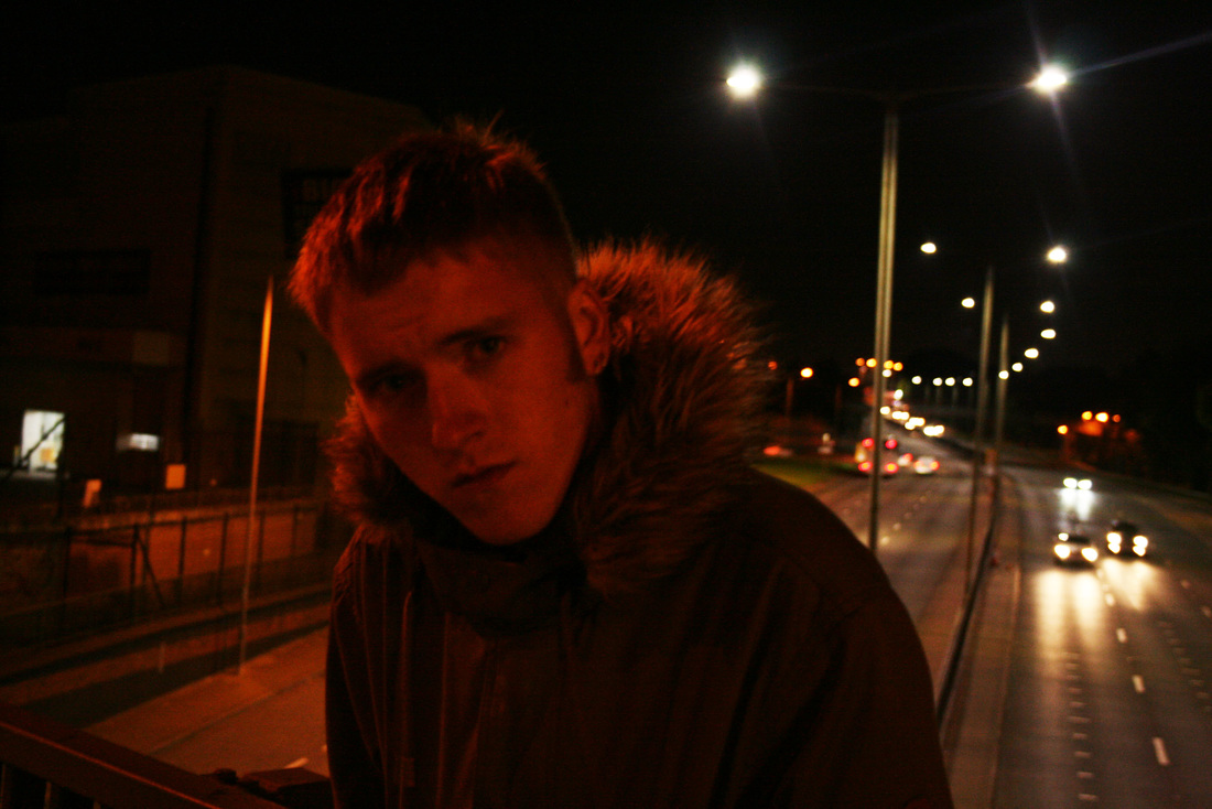
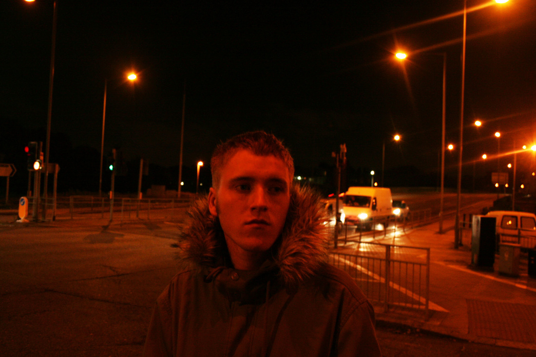
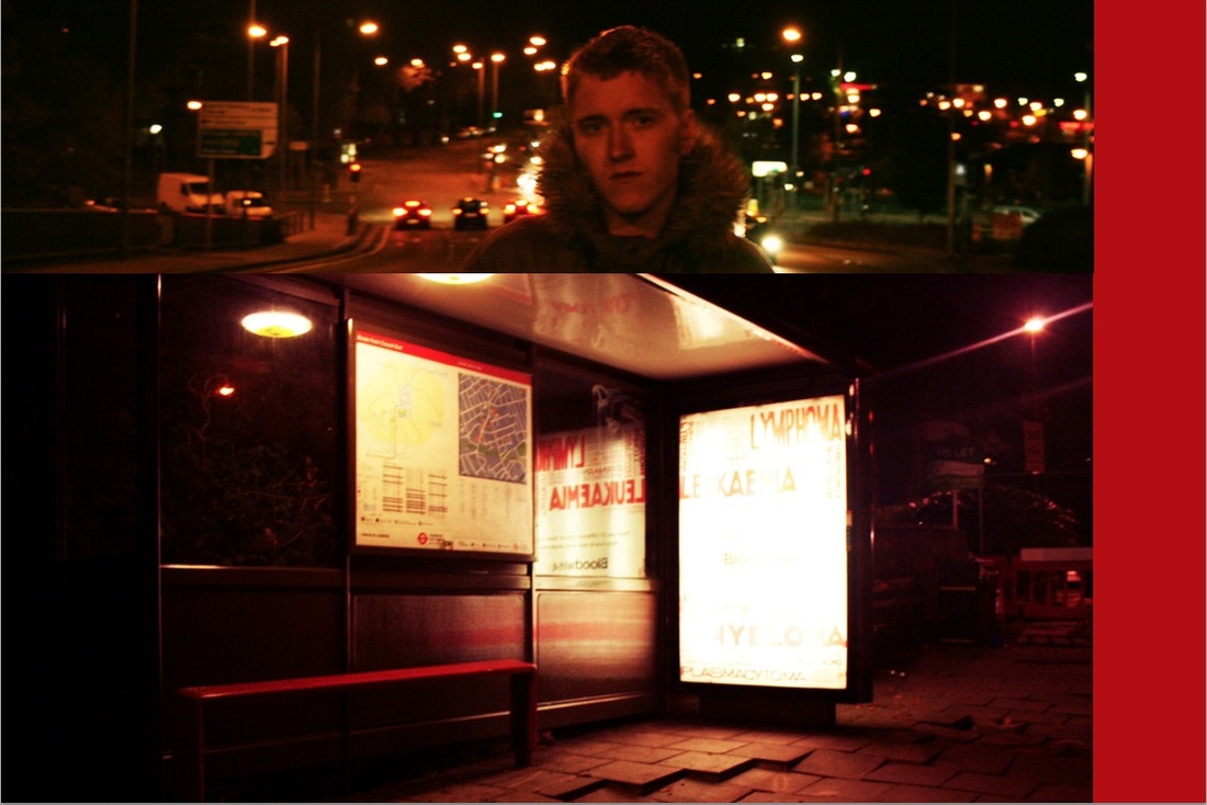
For this shoot, I went to a bridge that ran above a dual carriageway at night, to take portraits of my model. I decided to go at night so that the street lights would provide the lighting for my shots, and would give an amber/orange tone to my images. I discovered during the shoot that a tripod would have allowed me to capture these shots easier due to the low lighting. I chose this location due to it's openness, enabling me to get close up shots of my model against a very wide and distant background.
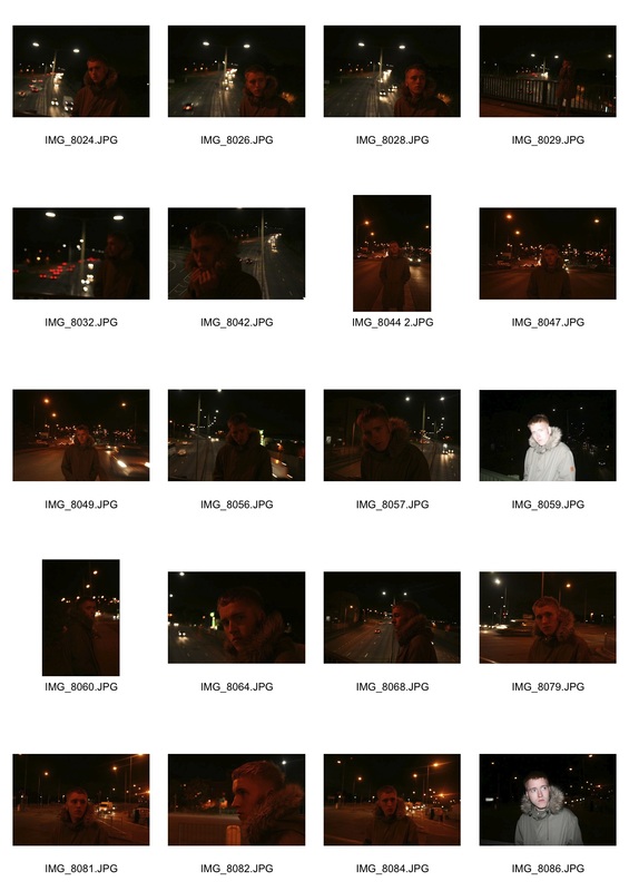
Night Road Portraits Contact Sheet
|
|
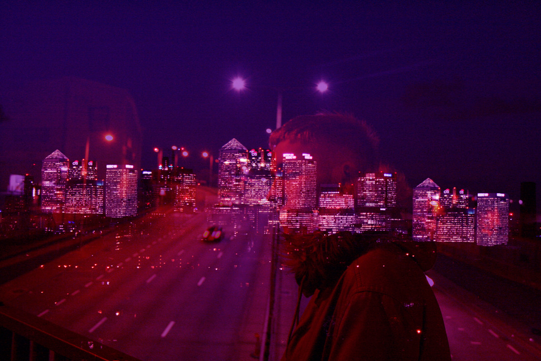
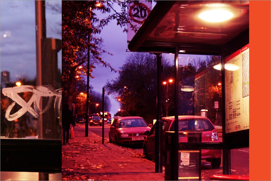
With this shoot, I wanted to focus on night time photography, using streetlights as the main light source. The amber colour emitted by the street lights instantly portray an urban environment. I also wanted to make it obvious in the shots that they were taken in a largely man made, city like area, so I decided to shoot my model alongside major main roads and motorways.
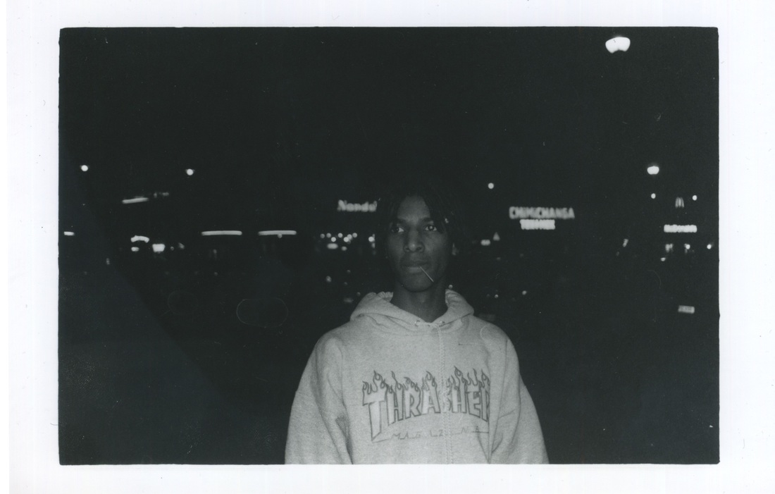
Film Camera Shots
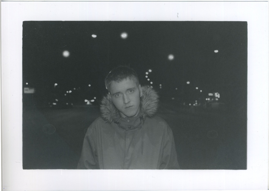
As these shots are in black and white, they don't have the same 'urban night' colours as the photos above. By this I am referring to the orange/yellow colour that the street lights emit, which allow viewers to get the feel of an urban environment. However, these photos still portray the dark vibe of a city at night as the bright lights contrast from the darkness of the night. As you can see, each of these three photos all have one thing in common, a figure in the middle.
|
|
Ewen Spencer |
Bruce Davidson |
|
This photographer creates a range of work including fashion editorials, films, magazines and personal work. One of his series featured shots of urban models around London, portraying their modern lifestyle and culture. For my project I have taken influence by these shots and the heavy street London style that they capture.
|
This photographer created a series of work of people on the subway in New York. I took a lot of inspiration from the composition of their shots, in terms of capturing people against city backgrounds that instantly gives viewers a sense of culture within that area.
|
|
|
Urban Environments
My work below was partly inspired by the work of Bruce Davidson in terms of theme and also composition to some degree. However, during this shoot I took some shots in my own style so that they would apply more to my project brief.
Below is a contact sheet for this shoot, and as you can see, I mainly took portraits in urban areas, but also took other landscape inspired ones as well to create a sense of location and mood.
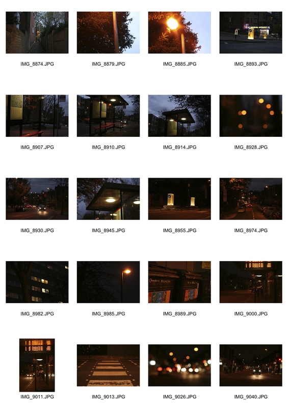
City Travelling Contact Sheet
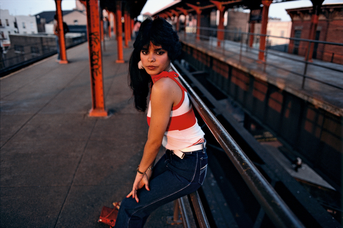
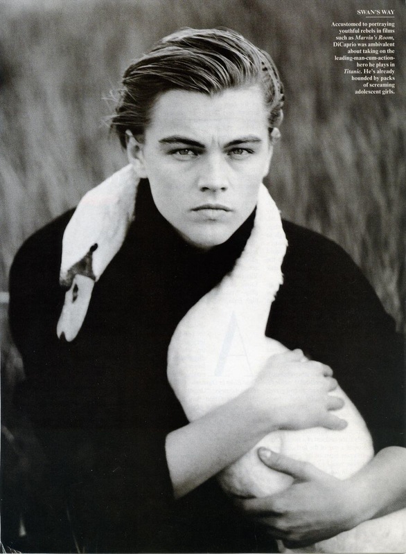
These photos were inspired by a number of artists and photographers, including the famous fashion photographer Annie Leibovitz. Whilst she is known for her shots with incredible detail involving huge sets and costumes, she has also taken many simpler images over the course of her career.
|
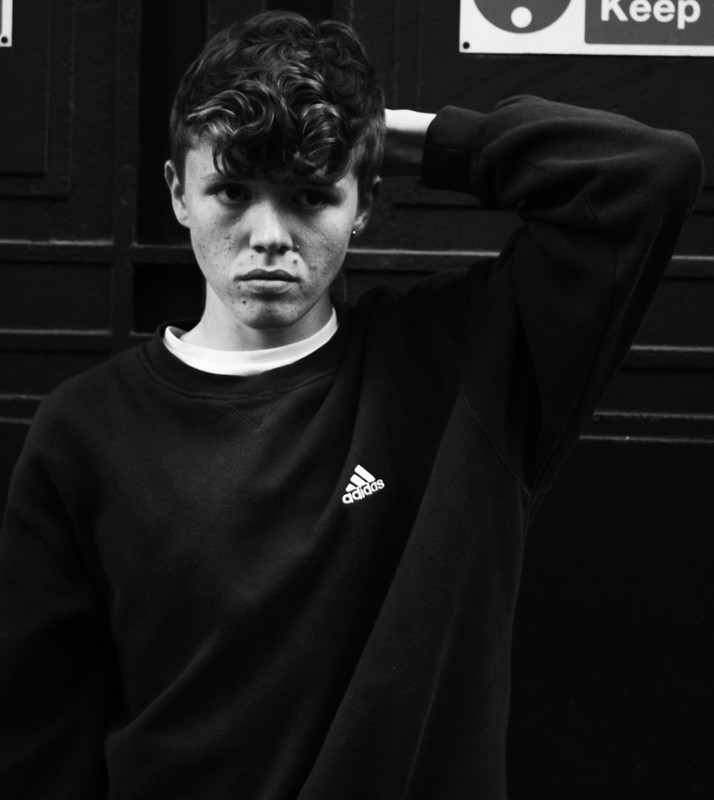
The image on the left was taken by the famous portrait photographer Annie Leibovitz. My photo above was inspired by her work. The simplicity and heavy contrast used in many of her black and white portraits shows famous individuals in a unique way, and allows viewers to see these people in a more personal way. Whilst my model above is not famous, I still attempted to portray a similar mood and level of emotion in my shot. To do this I set my model against a simple background, wearing subtle clothes, and asked them to look straight at the camera. Leibovitz's shot of Leonardo Dicaprio on the left was taken nearly ten years ago in 1997, so I decided to add a slight modern touch to my shot so that it had a more current aesthetic to it, but not so much so that it detracted from the simplicity of the shot.
|
|
|
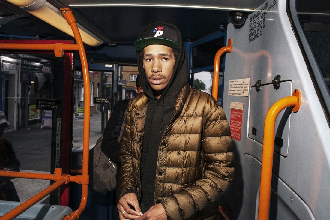
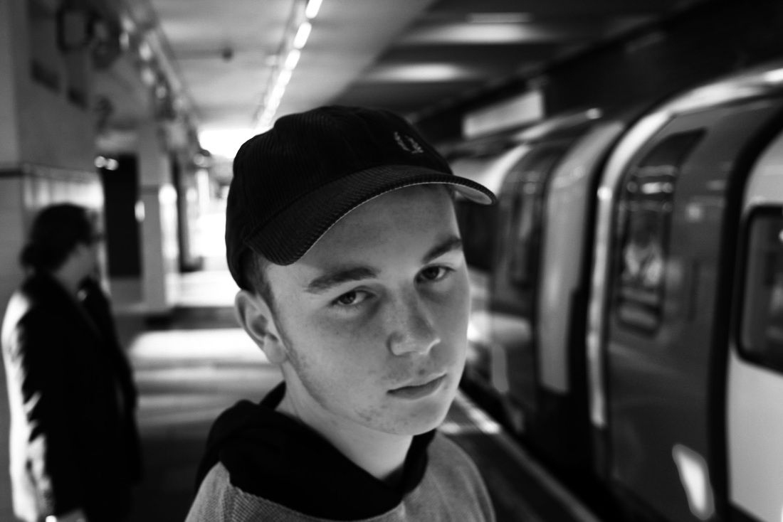
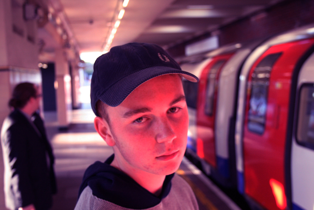
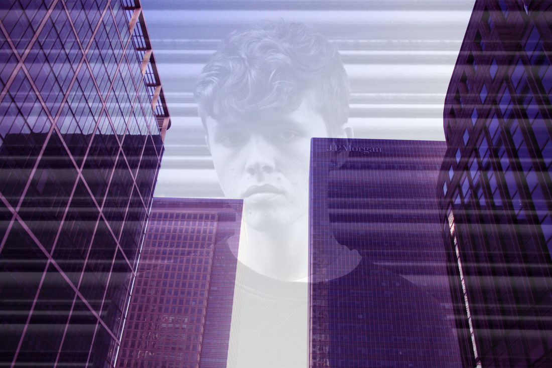
When editing my images, I usually see what they look like in many different ways, including making them black and white, altering their colour levels, or even changing their brightness and contrast levels. I am very intrigued at how manipulation of images on the computer can allow them to have a completely different meaning, or portray a different mood. As you can see above, I edited one image from this shoot in two different ways. When deciding which one I preferred, I found it difficult to decide as I like them for their own reasons. The shot above on the left being in black and white makes you focus more on the subjects face, and viewers notice the ranging contrast that runs throughout the image, showing the busy nature of a city (as this shot was taken at a tube station). Whereas the image above on the right portrays an almost similar mood, but through it's use of ranging colours. The red of the tube doors and the blue of the subjects hat contrast against the beige of the tube station.
|
|
Urban Architecture
After taking a mixture of portraits and architectural shots, and combining them in a way as if they were in a magazine spread, I decided that I wanted to focus more on architectural photography and experiment with different techniques. This would include both skyscraper type buildings and suburban architecture (e.g. the photo above). I knew that I wanted to focus on composition and simple detail.
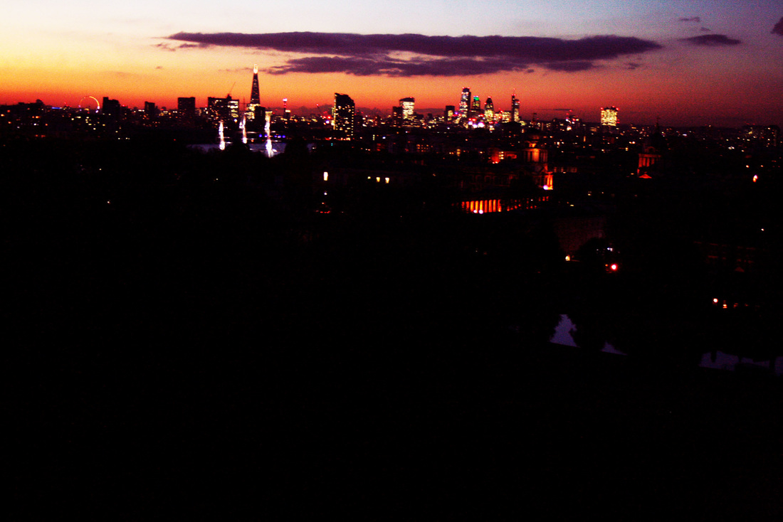
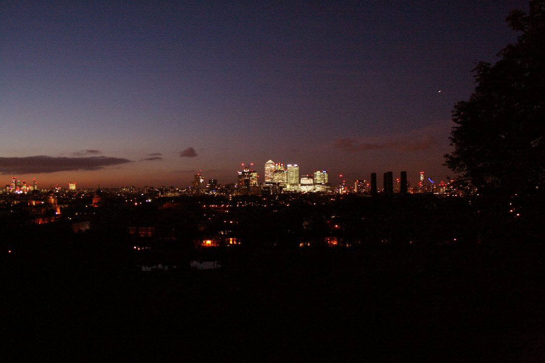
Greenwich Park Contact Sheet
|
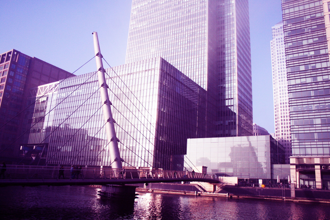
Canary Wharf Contact Sheet
|
These photos were inspired by the work of NIkolas Koenig. He created a series of architecture photos, which feature a range of styles and techniques, inlcuding wide angle shots and simpler ones. Both styles portray the simplicity and also detail of these modern buildings. The simple shape includes detailed patterns, which these photos highlight immensely.
|
|
My Response
In this response, I went to locations which captured the city's more modern architecture. These areas are less 'rough' and 'rugged' looking, but the photos still portray a sense of modern culture and all have a similar aesthetic as a set.
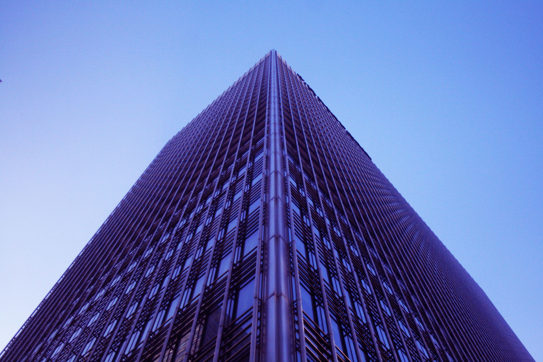
The shot above was taken in Canada Square. I instantly noticed the simplicity and symmetry of it's design, and wanted to capture it in a artistic way to show this. I immediately knew that composition would be key in doing this, so took a number of similar shots, moving slightly each time to ensure the building would be perfectly aligned within the frame.
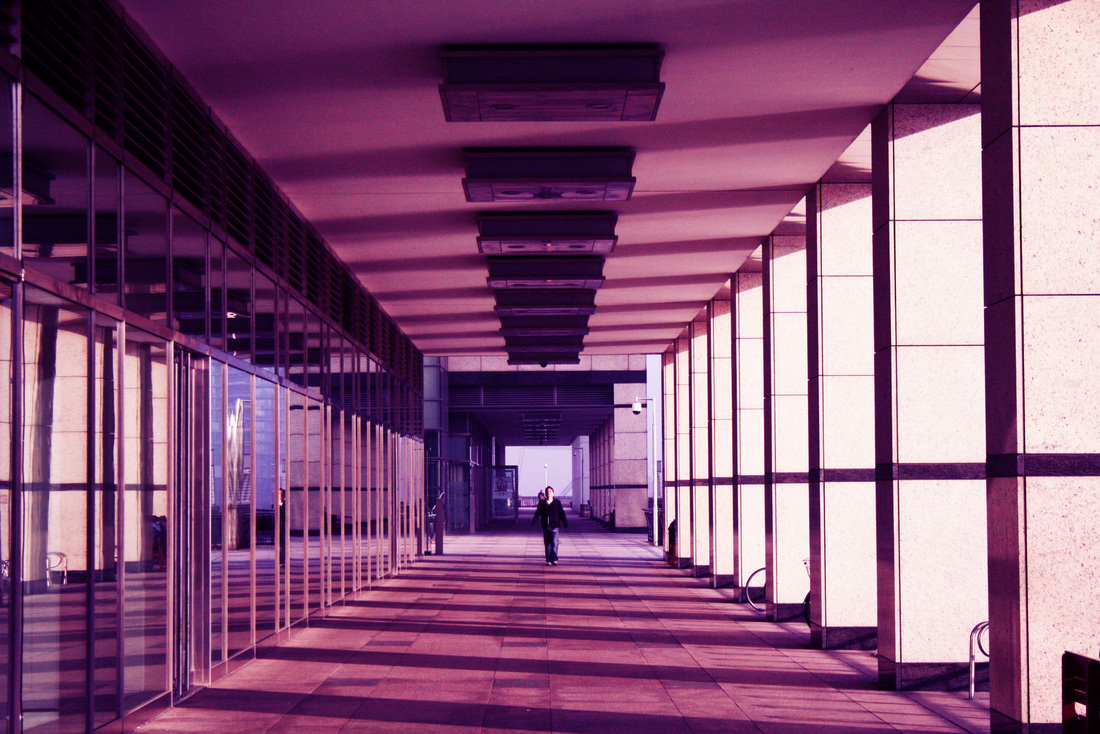
The same process was applied when taking the shot below. This image was the last one I took as I waited for the person at the end of the walkway to be in the middle and is my favourite from the shoot. I am particularly pleased with the level of symmetry and theme of shape and design that runs through this shot.
The same process was applied when taking the shot below. This image was the last one I took as I waited for the person at the end of the walkway to be in the middle and is my favourite from the shoot. I am particularly pleased with the level of symmetry and theme of shape and design that runs through this shot.
|
|
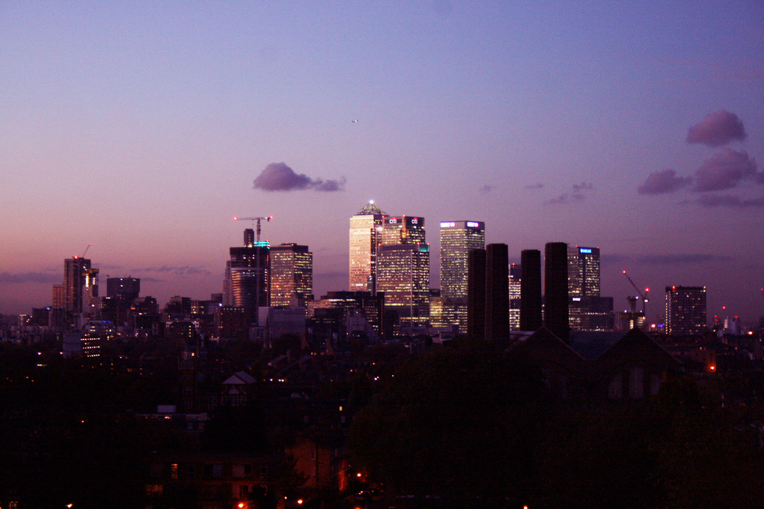
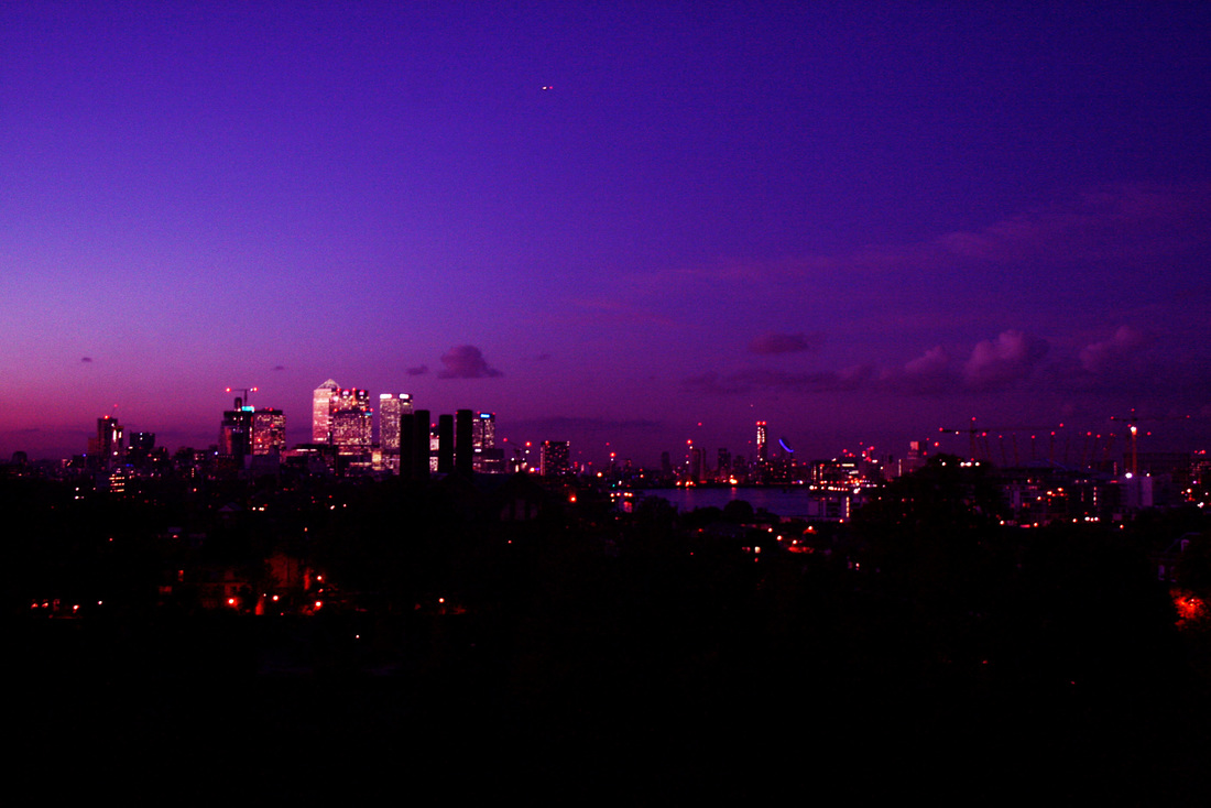
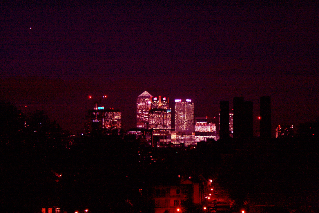
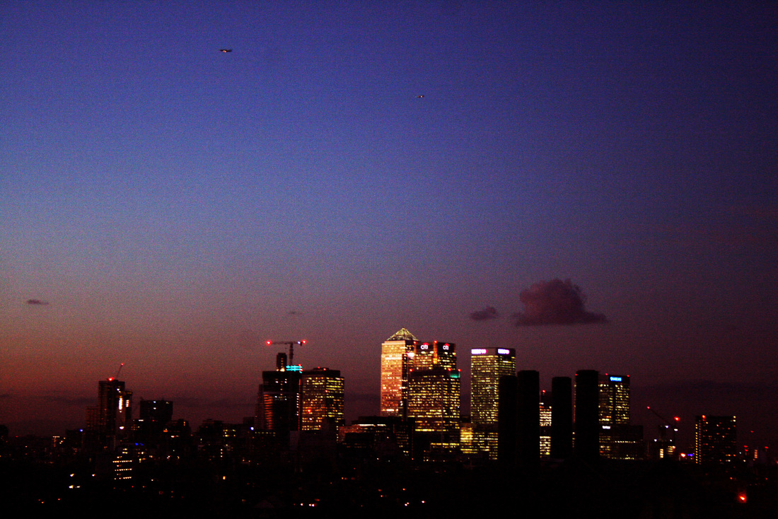
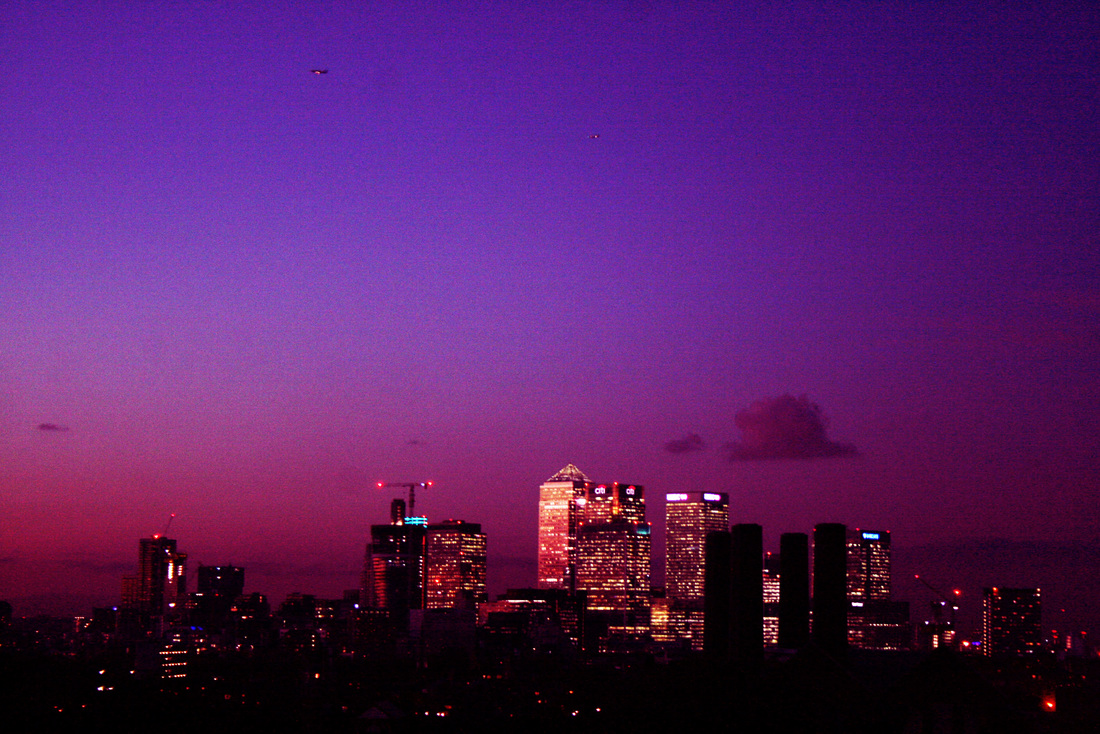
Below is an image that I took from Greenwich Park. As you can see, I have edited this shot to give it an almost 'vintage' aesthetic. I decided to include a lot of negative space in this photo to make the skyline of buildings in the center stand out. It was taken just as the sky was getting near to being completely dark, allowing the bright lights of the modern buildings to be highly noticeable.
|
|
|
|
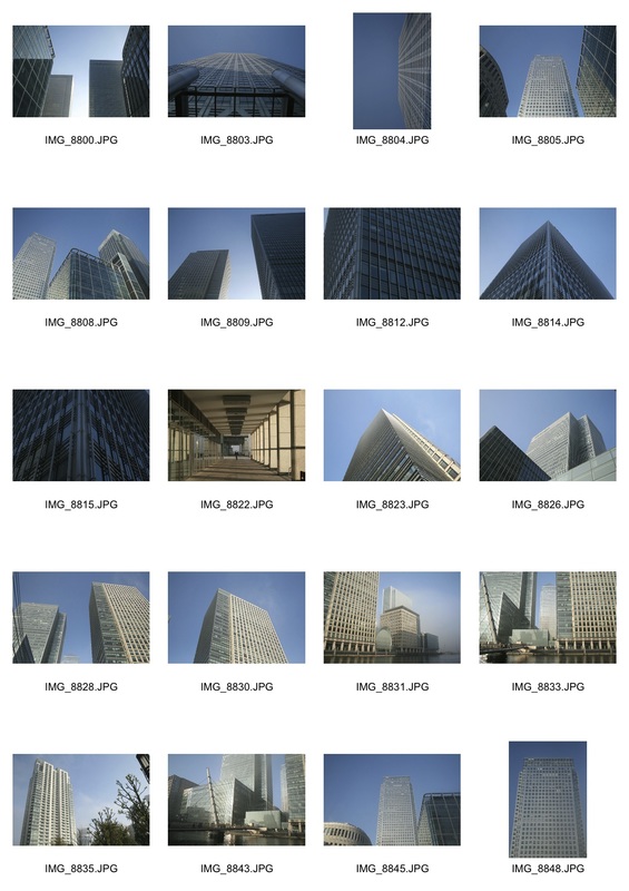
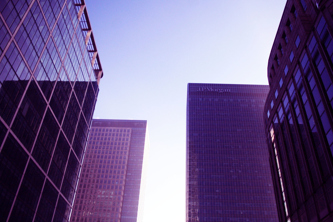
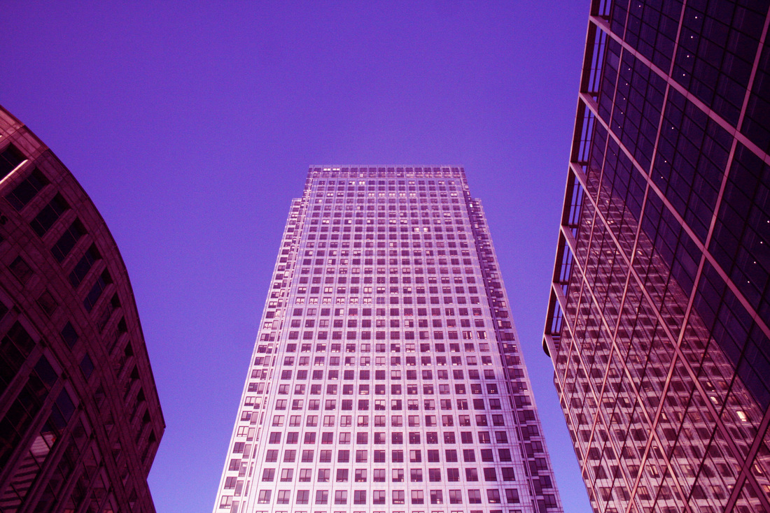
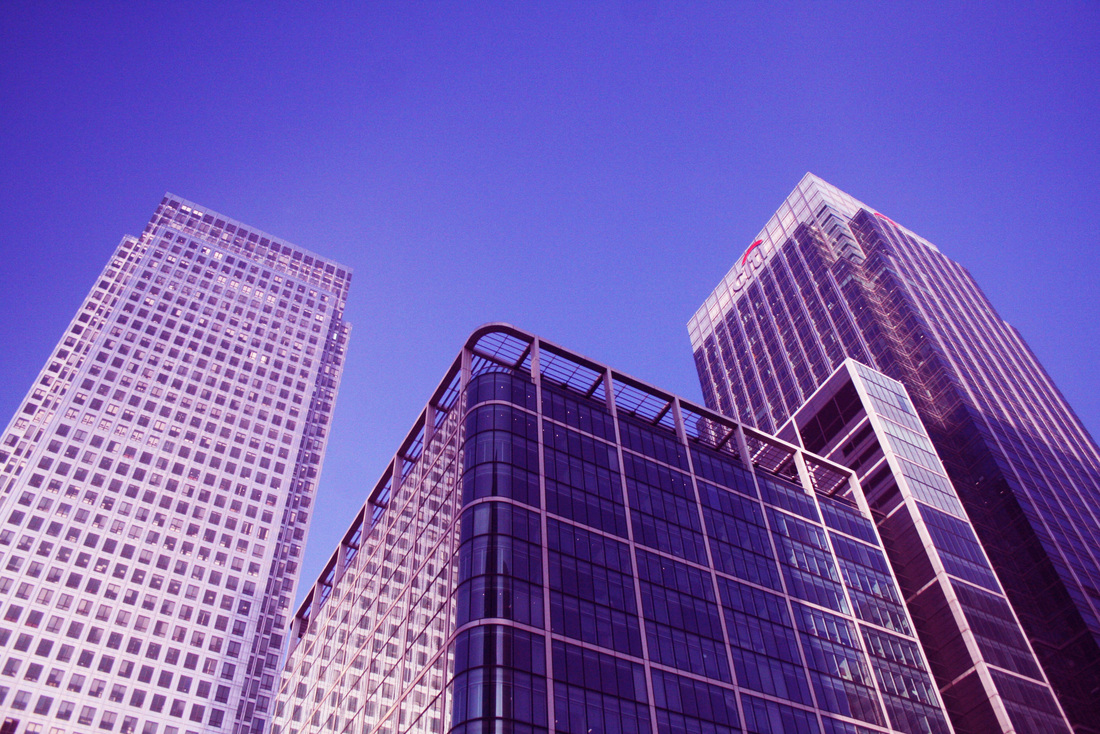
As you can see below, I went to Canary Wharf. I decided to do my shoot on a bright day so that I could capture the small detail on the tall buildings. Also, as I wanted to take shots from the ground looking upwards, I knew that my images would show these buildings against a blue sky, to contrast to the dark night skies that my previous work features. After selecting my favourites from this shoot, I then edited them in photoshop. Like most of my work so far, I brought the contrast and brightness up, which made the buildings stand out more against each other and the sky. I then altered the colour balance of my photos, making them look warmer and less dull.
|
|
This set of photos taken in canary wharf are similar to some that I took on a photography trip to Paris earlier this year. They both feature very modern tall buildings, and are shot from a the same perspective, looking up from the ground. These shots also focus on the subtle intricate details of these types of buildings.
|
|
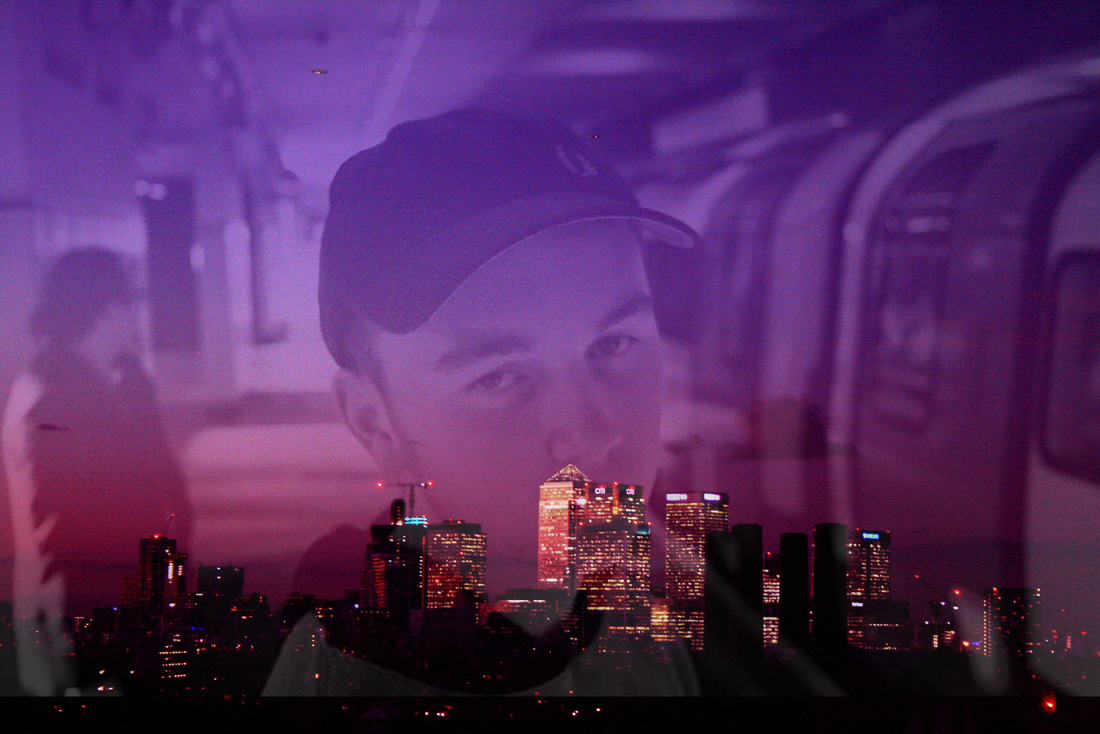
When editing the photos from this shoot, I suddenly had an idea to combine one of them with a shot from an earlier set of images. As you can see below, I experimented with merging a landscape skyline and a portrait shot together. Whilst this is visually unique and adds more dimension to the images, by doing this I lose the sense of meaning behind my shots. I decided that they look better still together, but on their own as a set.
|
|
|
Photo Collages
After taking both portraits and capturing urban architecture, I decided to create work that puts the two together. By doing this I created a series of photo collages, inspired by the book 'Snatch'. This was a step forward in my work as I was pushing my potential and making my intentions more clear in my photography.
As you can see in the slideshow below, I looked at the 'Snatch' book for inspiration with my use of colour strips within a collage of images. The colour strips highlight the ambience in the whole collage and sum up the mood of the photos in one single colour.
Snatch Book (2000)
This book was created after the popular film 'Snatch' was released. For the next part of my project, I took a lot of influence from the layout and design of this book. As you can see from the photos in the slideshow above, the book sets out it's photos in different layouts but always keeps it simple and effective. Only red, dark blue and black are used as the blocks of colour to go alongside the images, making the book feel more cohesive when turning each page. Also, quotes from the film are also used throughout the book to add a sense of story line and narrative. From studying this book and it's design, I began to take inspiration for my own work, planning to create my own photo collages with strips of colour and include quotes.
Urban Streets
Urban Streets Contact Sheet
|
These photos were taken around my local area just before it was completely dark outside. I wanted to take simple yet effective images for this shoot, so that they would work well both on their own as well as in collages. After choosing my favourites from the shoot, I edited them in photoshop to give them a more gritty and enhanced look. I set the contrast to a higher level and then altered the colour balance, so that the shots had an almost film like quality. I also used a tripod to make sure my shots weren't blurry and so that I could experiment with different angles and perspectives. This set features a range of angles to try and capture city streets in a recognisable yet unique way. Viewers may also notice the contrast between the regularity of patterns alongside irregular variations, such as the shot above. The windows are in a regular pattern, but the lights create random variation. This portrays the nature of 21st century living, where people live in very similar and symmetrical buildings, yet live completely different lifestyles. These photos also accurately emit an accurate feel of the time of year that they were taken in, the darkness of autumn, where streetlights add a warm glow to city streets.
|
Collages From The Shoot
|
|
As you can see in these collages, I cropped parts from 2 images, put them together, and then put a strip of colour along the side. The colours are taken from the shots themselves, with the orange above being from the light of the streetlamp, and the red below being from the bus stop seat. I've subtly drawn upon these colours to show colours that we come in to contact with on daily basis but maybe do not always notice. When choosing
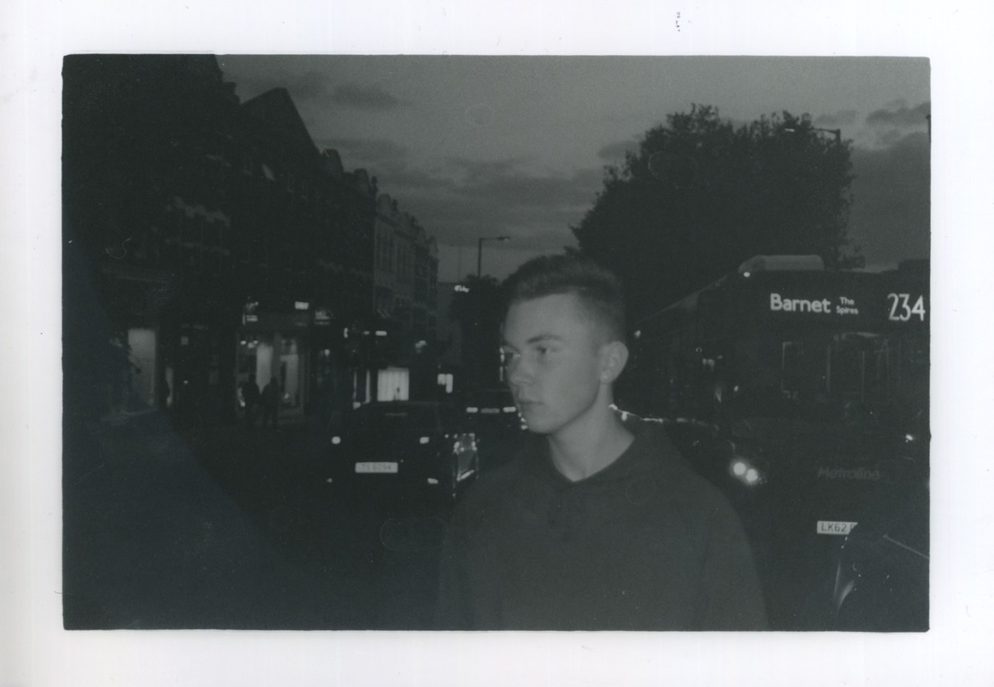
Film Photographs
Above are a series of film photographs, that were taken from the start of my project until now. They are mainly portraits in various settings, but there a some landscape shots as well. These shots were taken in locations including Canary Wharf, Westfield Stratford City, North Finchley, and Greenwich.
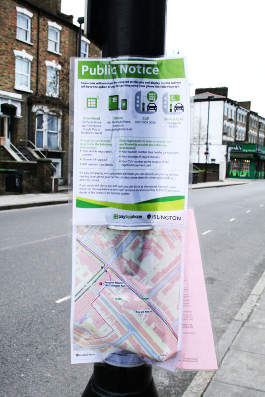
Gentrification
'Gentrification is a trend in urban neighborhoods, which results in increased property values and the displacing of lower-income families and small businesses.'
Within many cities, especially London, gentrification has recently been occurring in different areas. It can occur as a result of urban planning and development, where investors and businesses intend to grow their market, and create new areas out of declining ones, where they believe money can be made.
People have different views on gentrification. Some believe that it has a largely positive impact on an area and can create new job opportunities, and offer better future prospects. Whereas others think that it can destroy livelihoods and force people to leave their home town with it's history taken away.
After taking a range of photos including portraits and landscapes across the city of London, I decided to focus this unit on the gentrification of areas. I combined these two types of photography to portray my intentions, and used my current compositional skills to do so and progress my work.
My last section of this task portrays 2 different areas in London that are facing a new era of gentrification, Stroud Green and Green Lanes. My work shows this change of shops and mood in a unique way, whilst still showing the previous, older aspects of the areas. It shows a clear contrast between the 2 types of cafes and businesses, and how they impact on these areas.
Gentrification of Areas
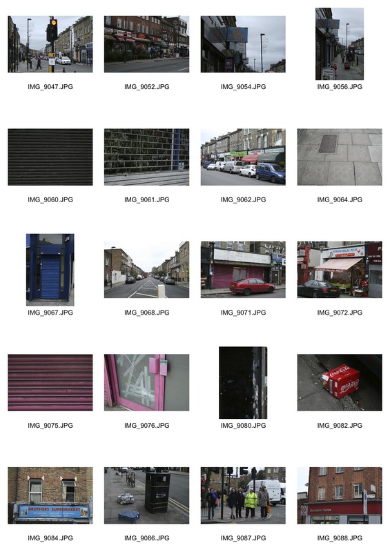
Stroud Green
|
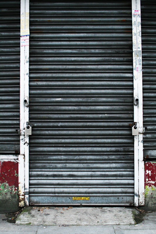
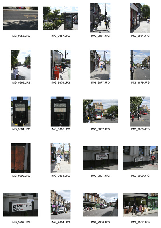
These shots were taken along Stroud Green road in North London. With this shoot I wanted to capture mainly the various run down shops along the high street. As you can see below, I photographed the high street in a way to show as many small details as possible.
|
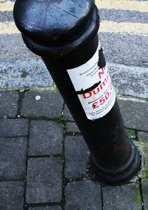
After photographing a range of people and places, trying to capture different urban environments within London, I decided that I wanted to focus more on the social aspect of urban areas. By this I mean capturing the gentrification of areas, showing how many urban towns within the city are changing in terms of shops and cafes, and general look. I planned out different areas in North London that I would go to to photograph, starting with Stroud Green as you can see above. The aim of this shoot was to simply capture the aesthetic of the area, created by the run down shops and 'grey' look to the high street.
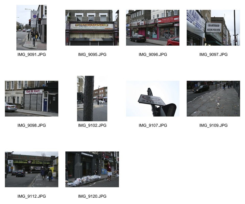
Green Lanes
These photos above were taken along the high street Green Lanes in North London, particularly well known for its range of Turkish, Greek and Cypriote shops, restaurants and businesses. Like with my Stroud Green shots, I wanted to capture the environment, ambience and people within this area in my photos.
Kristy Chatelain
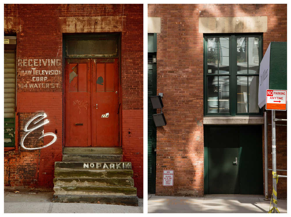
An artist, Kristy Chatelain, created a series of work entitled 'Brooklyn Changing', showing the gentrification of Brooklyn in recent years. As you can see from the images below, she has put two photos of the same place together, one taken at a certain time, and then the next a few years later. This allows viewers to clearly see how a particular building or doorway has dramatically changed, and been developed to look more modern and less rough.
I took a lot of inspiration from her work when taking shots for this gentrification section.
I took a lot of inspiration from her work when taking shots for this gentrification section.
|
|
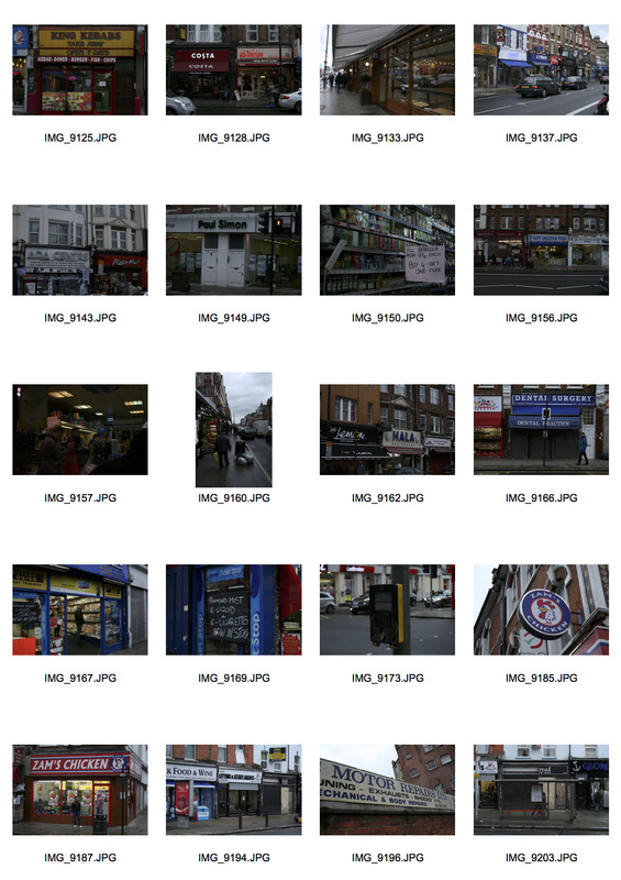
Stroud Green Second Shoot
|
|
The photos below are from my second shoot in Stroud Green. This time I wanted to capture the more up market shops along the high street, to end up portraying the contrast between the difference in cafes and shops within the area. Whilst taking these shots I took the fact that I would use them for my collages in to consideration. This allowed me to consider my composition and framing, so that my collages would work well aesthetically.
Close Ups
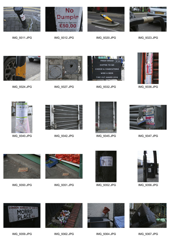
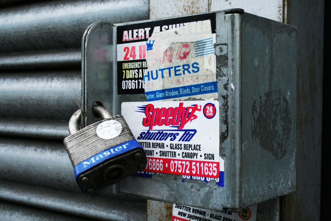
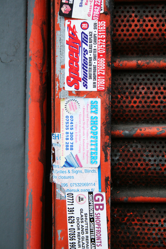
For inspiration, I looked at the work of Barry Lewis, who created a series of work focusing on small random details within urban areas, many of which would not be noticed by someone passing by. These shots gave me a fairly strong idea of how I wanted to capture the small details within my 2 chosen areas.
|
|
These photographs show the detail and rough aesthetic in parts of Stroud Green. Whilst editing these shots, I decided to increase the contrast and brightness to further show the detail and textures within my photos.
|
|
|
|
|
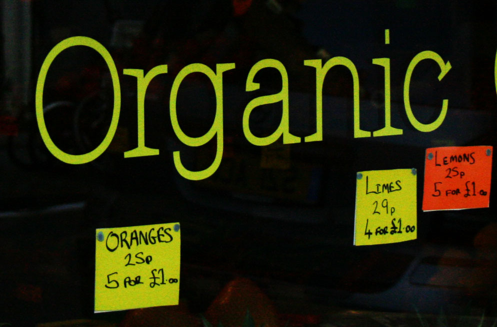
Food Based Shoot
My aim with this shoot was to capture the different types of food that are associated with shops throughout Stroud Green. As there are a range of different cafes and restaurants, I wanted to photograph the different foods and boards used within the area.
As you can see below, I mainly took close up photos of the different food, and focused on showing the difference in cuisines that are available in the area. The fancier cakes and healthy vegetables contrast against the fried chicken and greasy spoon cafe, further showing the range of cultures and cuisines that exist in Stroud Green.
As you can see below, I mainly took close up photos of the different food, and focused on showing the difference in cuisines that are available in the area. The fancier cakes and healthy vegetables contrast against the fried chicken and greasy spoon cafe, further showing the range of cultures and cuisines that exist in Stroud Green.
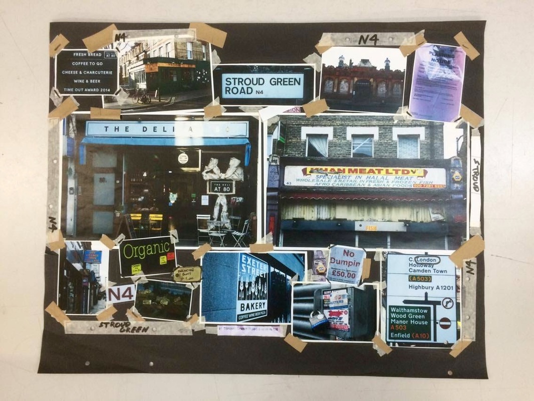
First Stroud Green Collage
Below is a collage that I produced using a range of photographs that I had taken in Stroud Green (as shown above). As you can see, I used a lot of cropped photos to emphasise my intention of portraying the culture and contrast of shops, restaurants and cafes within the area. I was inspired by the book 'God Made Dirt', which heavily used various tapes and cut outs to create unique collages and works of art.
However, whilst I thought that a collage was the best medium to portray my work, I did not feel that this collage was pushing my potential enough, and that I could further show my intentions by expanding on this collage.
However, whilst I thought that a collage was the best medium to portray my work, I did not feel that this collage was pushing my potential enough, and that I could further show my intentions by expanding on this collage.
Final Stroud Green Photos
|
Before composing my final piece, I realised that I wanted to include more photos that showed people around Stroud Green. I decided to capture shots of several people going about their normal day, so that I could make my final piece more raw looking and be more representative of the nature of Stroud Green. In terms of composition, I decided to take shots from my normal point of view perspective, to allow viewers to feel like they were on the street as well, and immerse them in the ambience of Stroud Green.
If I was to improve this process, I would have taken more photos of people closer up, or possibly even get simple portraits of random passers by in the area. However, I was still satisfied with the shots that I got and started planning out how I could merge them in with my previous shots in my final piece. By including shots of people in my final piece alongside building and landscape photos, it is clear how I have developed my work over this unit. As I started by taking separate sets of portraits and landscapes with little connection to each other, I now have merged the two types of photograph to portray one whole intention. This intention is showing the ambience and culture within Stroud Green. |
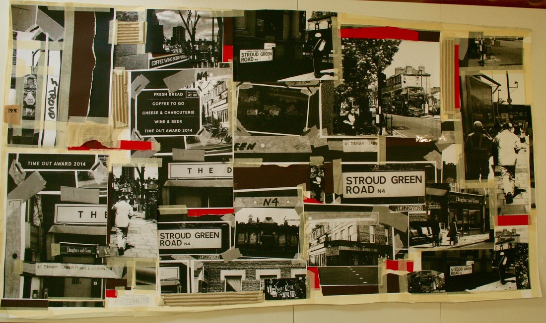
Final Piece - Stroud Green Collage
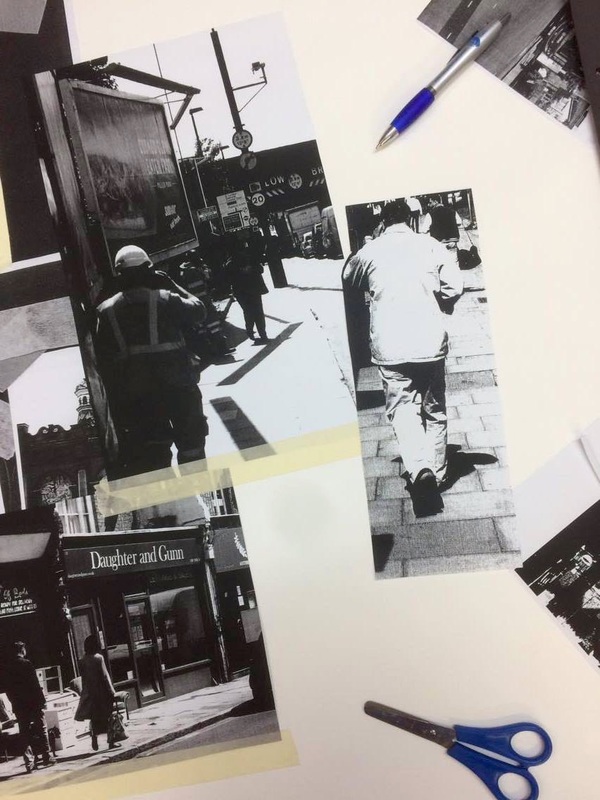
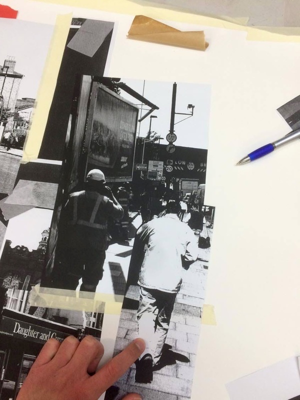
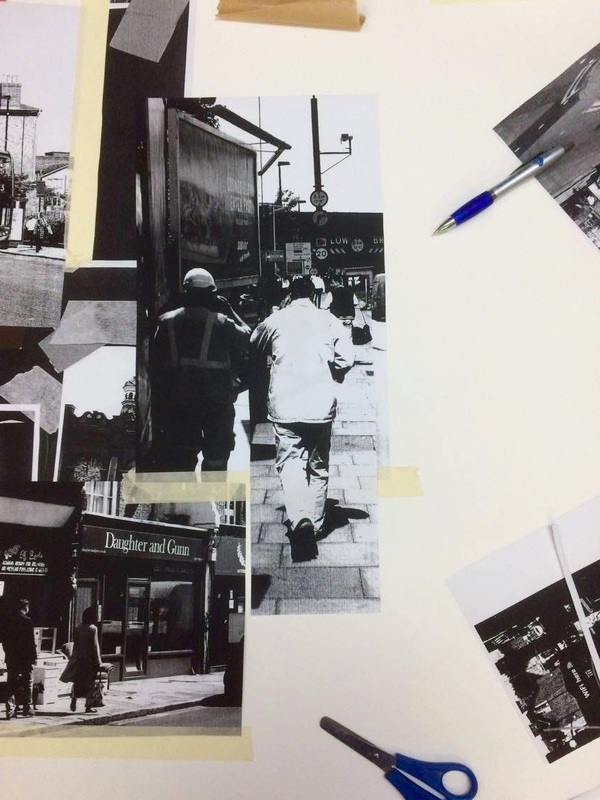
For my final piece for this unit, I decided that I wanted to progress from my previous collage and create a much larger one, composed of many more separate photographs, alongside various tape, coloured paper, cardboard and cut outs. My final outcome was a large collage, primarily in black and white, with hints of coloured paper and random strips of masking tape holding down different cut outs. As I wanted to portray the area Stroud Green, I wanted my collage to include a range of textures, shading and different angled photos. This was to portray my intention of representing the ambience, culture and people within Stroud Green.
|
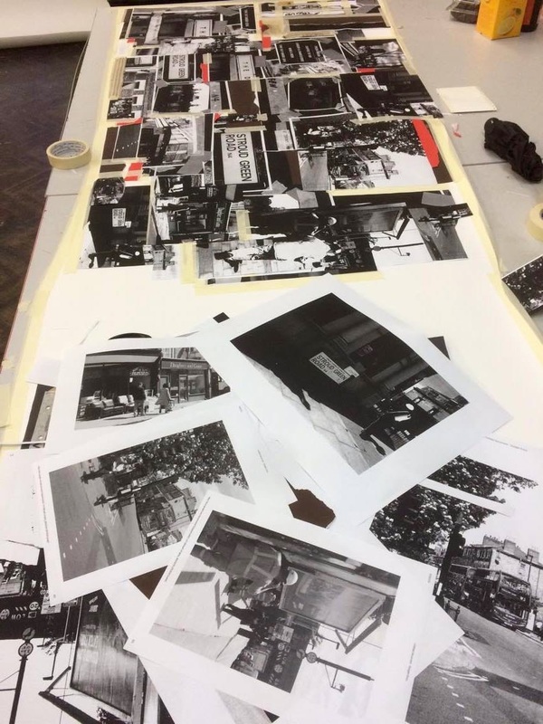
The photo on the left shows my collage near completion alongside printed out black and white photos that I had been using.
I scanned in my previous smaller collage in to a photocopier and produced various enlarged prints from separate sections in black and white. This process of constantly using my original photos in different ways represented the way that Stroud Green as an area has been through a similar process of development and gentrification, with shops and buildings being changed and altered every few years. My random and unstructured use of masking tape, coloured paper and cardboard reflects the imperfect nature that Stroud Green holds as a place. Pavements, roads and shop fronts are not perfectly polished, and the area is generally the opposite of 'sleek'. I wanted to portray this rough and rugged aesthetic by making my collage somewhat unstructured, including different sized photos and prints, and rough cut masking tape. I also decided to portray this theme in my final piece by making by collage within an unusual frame. As you can see below, the collage is not completely straight and has unusual dimensions. This further represents the different angles to Stroud Green and how it is has a range of people and cultures within it. |
The three photos below show how, within my collage, I merged sections from two separate photographs together to make them seem like one. This merge of shots represents how the area includes a mix of cultures and people that intertwine together on a daily basis. As Stroud Green features a range of different restaurants, cafes and various shops, this means that different people visit the area.
|
|
|
The photos in the slideshow below give a closer view of how I stuck down different images together and collaged different photos in black and white using masking tape.
Overall I feel that my final piece successfully portrays the ambience, culture and people of Stroud Green, through photos of shops, people and small details that all contribute to the feel of the area.
Overall I feel that my final piece successfully portrays the ambience, culture and people of Stroud Green, through photos of shops, people and small details that all contribute to the feel of the area.
